

18 July 2018
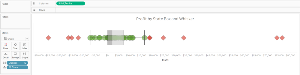
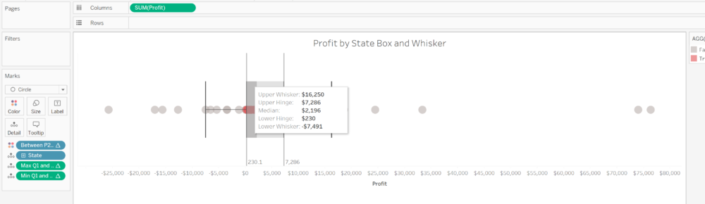
If you are familiar with the box and whisker plot you already know is a very good chart to check the distribution of data and highlight outliers. But sometimes is not enough to just show the outliers, sometimes we also want to filter the outliers because those outliers can be caused due to data issues or some particular cases we don't want to include in our analysis. How can we filter the outliers in Tableau based on the logic of a box and whisker plot?So, in case you are not sure about how a box and whisker plot looks like, this is a simple box and whisker plot.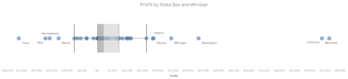 Each circle of the chart represents the total profit for each State of the USA using our friend Sample Superstore Sales Excel file. The box shows the median of the profit distribution by State and also the range between the percentile 25 (lower quartile) and 75 (upper quartile). Then we have both whiskers representing the lowest datum still within 1.5 IQR of the lower quartile, and the highest datum still within 1.5 IQR of the upper quartile as we can see when we edit the reference lines in Tableau. The IQR is the interquartile range - the difference between the upper quartile and the lower quartile -. So each whisker shows the data points between that range.
 So if we want to filter or highlight the outliers, we need to calculate the IQR and all the data within +/- 1.5 times the IQR. How we do this?
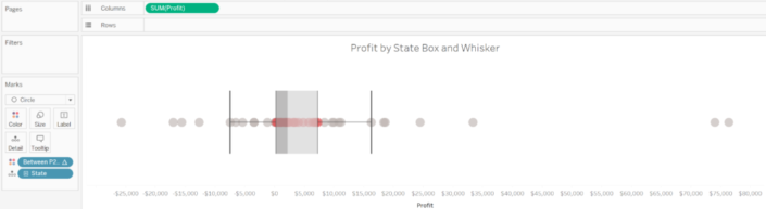
 Looks very similar to the image after step 1, but if you pay attention, you can see the two reference lines using the calculations just built and how they match with the lower and upper hinge. We are getting close!
 In size to make outliers bigger or smaller.
 Or even in shape, and highlight the outliers in that way.
 But instead of using my Outliers calculation in color, I'm going to remove the box and whisker reference lines and bands, and drop the Ourliers calculation to filters, and EXCLUDE the TRUE values. And maybe I'll add a reference line to show the average profit of each State by sub-category, but without taking into account the States that are outliers for each Sub-Category.
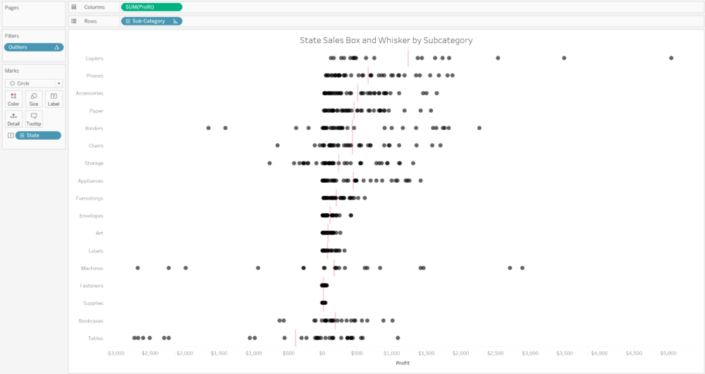 Done! And view and analyse my data without those outliers, being able to see how the profit for each State distributes across Sub-categories much better than before.
 Each circle of the chart represents the total profit for each State of the USA using our friend Sample Superstore Sales Excel file. The box shows the median of the profit distribution by State and also the range between the percentile 25 (lower quartile) and 75 (upper quartile). Then we have both whiskers representing the lowest datum still within 1.5 IQR of the lower quartile, and the highest datum still within 1.5 IQR of the upper quartile as we can see when we edit the reference lines in Tableau. The IQR is the interquartile range - the difference between the upper quartile and the lower quartile -. So each whisker shows the data points between that range.
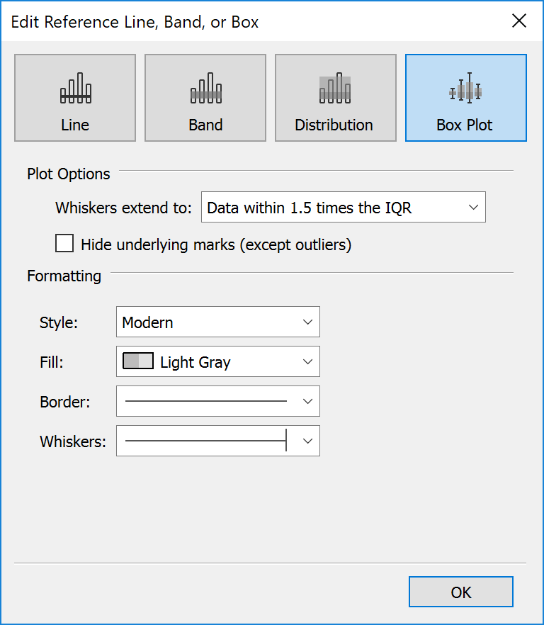 So if we want to filter or highlight the outliers, we need to calculate the IQR and all the data within +/- 1.5 times the IQR. How we do this?
Step 1: Calculating the Percentile 25 and Percentile 75
First we are going to calculate all the data between the percentile 25 (Q1) and percentile 75 (Q3). That is, all the data between the box of the chart. To do so we will create a calculated field using the rank percentile of our measure (Profit) and use a boolean calculation to return a TRUE value for all data points between that range.Between P25 and P75:RANK_PERCENTILE(SUM([Profit]))<=0.75 and RANK_PERCENTILE(SUM([Profit]))>=0.25
This calculation will return a true value for any data points with a sum of profit between the Q1 and the Q3. In our example, we have to make sure that the calculation is computed using the State. We can make sure the calculation is working the way we want adding it to the color shelf of our previous view.
Step 2: Calculating the limits of the box - Lower & Upper Hinge
We have highlighted all the data points between Q1 and Q3 in step 1. Now we need to calculate the lower limit of Q1 and the upper limit of Q3 so we can then calculate the IQR, this is, the difference between the percentile 25 and percentile 75. Normally we could use an LOD to calculate those numbers, but because we are using the Rank Percentile, a Table Calculation, and we can't use Table Calcs inside an LOD we will need to look for another solution. To do so, we will use an IF statement inside a WINDOW_MAX so we only get the window max of the data between percentile 25 and percentile 75 - the upper hinge.Max between Q1 and Q3:WINDOW_MAX(IF [Between P25 and P75] THEN SUM([Profit] ELSE NULL END)And we will do the same to calculate the minimum value for the lower hinge, the lower limit of our between Q1 and Q3 calculation.Min between Q1 and Q3:WINDOW_MIN(IF [Between P25 and P75] THEN SUM([Profit] ELSE NULL END)Like we did with the calculation in step 1, in our example we have to make sure both calculations are computed using State. We could also add both calculations to the detail shelf and add them as reference lines to check that the numbers are correct, like in the image below. Looks very similar to the image after step 1, but if you pay attention, you can see the two reference lines using the calculations just built and how they match with the lower and upper hinge. We are getting close!
Step 3: Calculate the IQR
We mentioned before that the IQR is the difference between Q3 and Q1, so the difference between the upper and lower limit of the data between percentile 25 and percentile 75. In other words, the difference between the two calculations we built in step 2. This is probably the easiest step of this post:IQR:[Max between Q1 and Q3] - [Min between Q1 and Q3]Step 4: Calculating the lower and upper whiskers
Step 3 was easy, and step 4 is not much difficult. We saw before that Tableau extends the whiskers to the data within 1.5 times the IQR. So we just need to use the lower and upper limits of the data between Q1 and Q3 built in step 2 and the IQR calculated in step 3 to calculate the range of the data between the lower and upper whisker, like this:Lower Whisker Limit:[Min between Q1 and Q3] - (1.5 * [IQR])Upper Whisker Limit:[Max between Q1 and Q3] + (1.5 * [IQR])Be careful and pay special attention to the difference. We have to subtract 1.5x the IQR for the lower whisker and add 1.5x the IQR for the upper whisker. As always, in our example we will have to make sure this calculations are computed using the State dimension.Step 5: Flag the outliers
We are very close. Now we have all the values to identify the outliers. Basically, an outlier will be any data point with a sum of profit lower than our Lower Whisker Limit or higher than our Upper Whisker Limit. We can create in a very similar way as we did in step 1 a calculation that returns a TRUE value for those outliers.Outliers:SUM([Profit]) < [Lower Whisker Limit] OR SUM([Profit]) > [Upper Whisker Limit]Again, make sure the calculation is computed using the State (if you are following our example) or the dimension that represents your marks (circles). We can use this last calculation in the color shelf to highlight the outliers.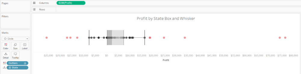 In size to make outliers bigger or smaller.
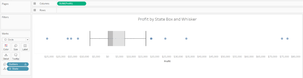 Or even in shape, and highlight the outliers in that way.
Step 6: Filter outliers
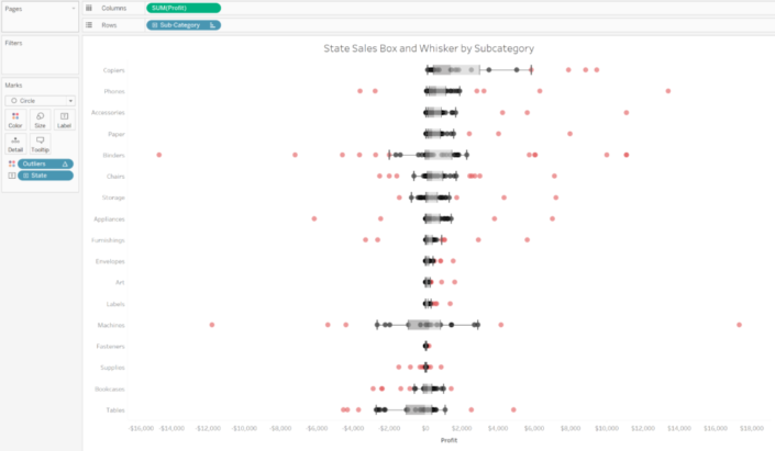
But following the main purpose of this post, what we can do now is filter the outliers. But have in mind that the Box and whisker plot will then recalculate with the new data. For instance, if now we add the Sub-category to rows, we will get a view like this, highlighting the outliers using color as we mentioned in step 5.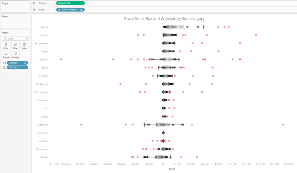 But instead of using my Outliers calculation in color, I'm going to remove the box and whisker reference lines and bands, and drop the Ourliers calculation to filters, and EXCLUDE the TRUE values. And maybe I'll add a reference line to show the average profit of each State by sub-category, but without taking into account the States that are outliers for each Sub-Category.
 Done! And view and analyse my data without those outliers, being able to see how the profit for each State distributes across Sub-categories much better than before.