

Earlier this year I was approached by a customer who had a specific problem; they needed to visualise the size of different groups of customers, and the effect that removing them from an overall population.
You might run into a similar situation when constructing groups for a marketing campaign, or perhaps looking at which customers may be affected by a discount or promotion. The problem comes when customers can belong to multiple groups, e.g. groups might be things like Over 65's, Men, and High Earners. We'd like a tool to construct a campaign dynamically and, as we remove these groups, we want to visualise the effect of our changes. The order with which we remove groups will matter, because the overall sub-populations removed at each stage will depend on who was removed in previous steps. NB. the total removed won't change, but the number removed at each stage will.
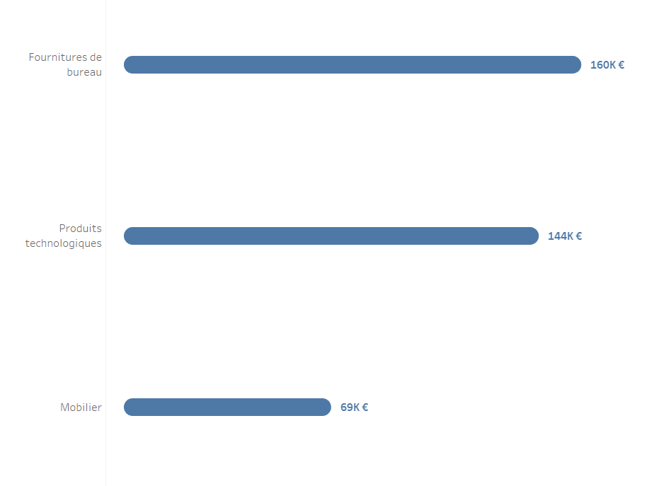
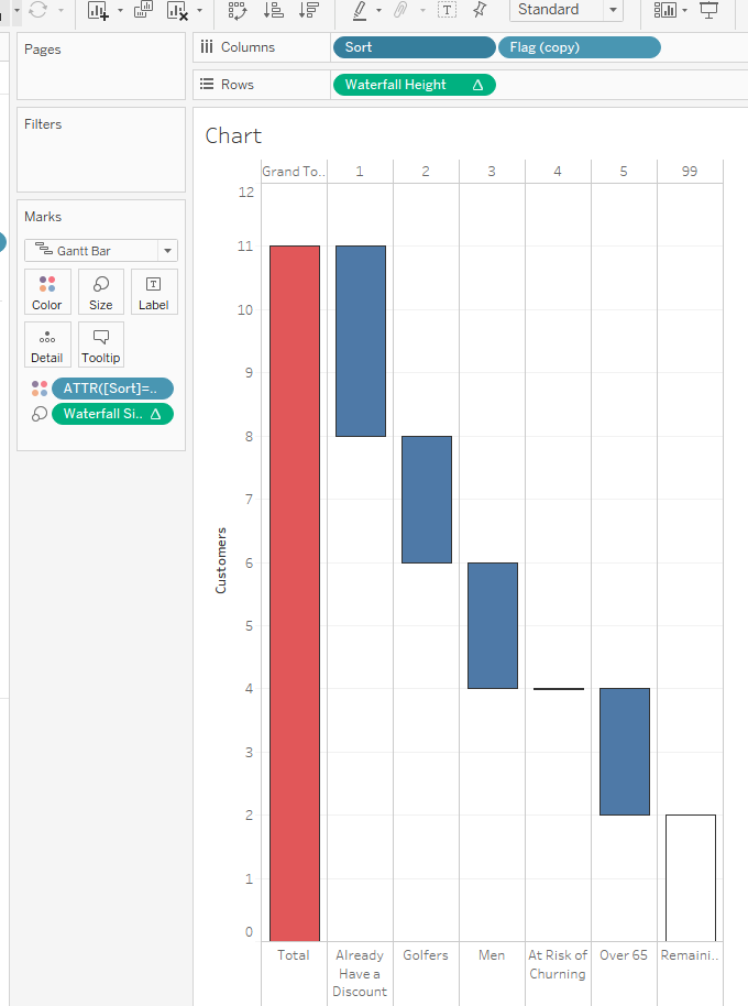
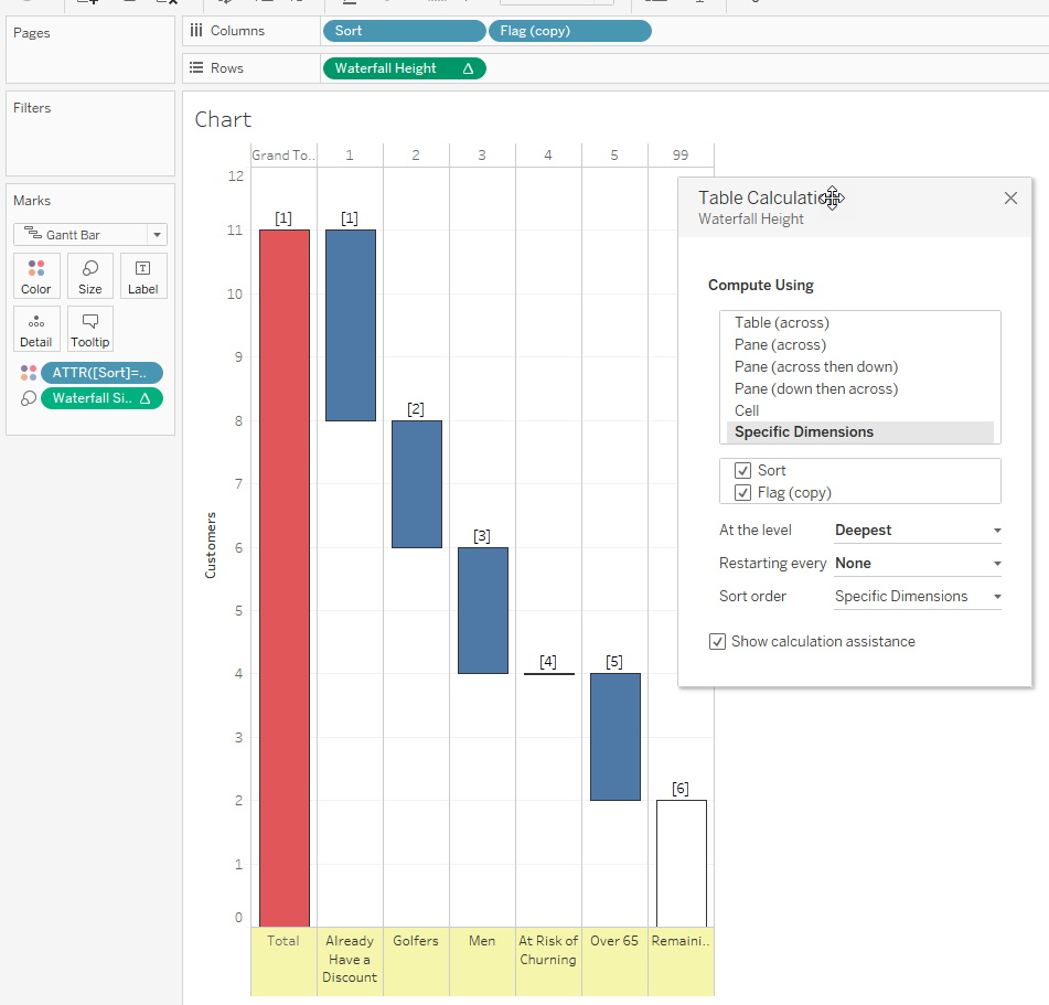
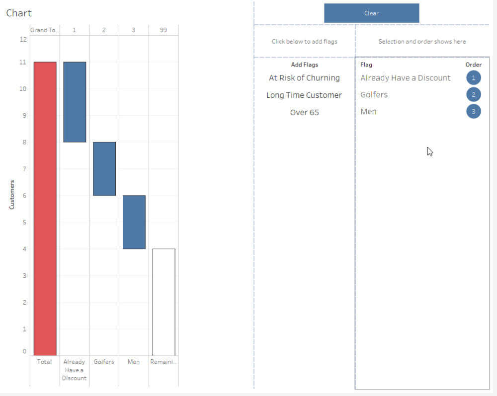
To illustrate what I mean let's look at an example:
We can see three customers already have a discount, lets remove them:
There are three golfers, let's remove those too - but note that one already had a discount so isn't removed, so only two are removed:
I want to walk you through the elements of how to build this kind of chart.
How To
The work below draws on Jonathan Drummey's excellent post about using parameters as a data source, which in turn drew on work from Mark Jackson. If you aren't familiar with the technique, popularised by TIL Data School Alumni and Tableau Zen Master Marc Reid, then I recommend you see Marc's talk at the Belgium TUG. If you've watched all that and are familiar with the technique then the below will still be complex but should at least be understandable with the workbook downloaded from Tableau Public and some patience.
Step 1. The Data
The underlying data source should simply be a long, tall file of the 'accounts' and the attributes they share. In my example these are all of length 1, a single letter, and aliased later for my demonstration - this makes the maths easier later when adding and retrieving them from the data source.
If your data isn't in this format, use Tableau Prep or another tool to prepare it.
As you can see, the relative sizes of the populations and the order we remove them is key so we can work out the impact of removing different groups, as well as communicating that to others in the business.
You can play with the chart on Tableau Public here to get a feel for how it works (and download and play with it if you wish):
[iframe src='https://public.tableau.com/views/DynamicOrderedWaterfall/Dashboard?:display_count=y&:origin=viz_share_linky?:embed=true&:display_count=yes&:showVizHome=no&:toolbar=yes' width='10000px' height='800px' scrolling='no']Link: https://public.tableau.com/shared/3HFG7S8KH?:display_count=y&:origin=viz_share_link
I want to walk you through the elements of how to build this kind of chart.
How To
The work below draws on Jonathan Drummey's excellent post about using parameters as a data source, which in turn drew on work from Mark Jackson. If you aren't familiar with the technique, popularised by TIL Data School Alumni and Tableau Zen Master Marc Reid, then I recommend you see Marc's talk at the Belgium TUG. If you've watched all that and are familiar with the technique then the below will still be complex but should at least be understandable with the workbook downloaded from Tableau Public and some patience.
Step 1. The Data
The underlying data source should simply be a long, tall file of the 'accounts' and the attributes they share. In my example these are all of length 1, a single letter, and aliased later for my demonstration - this makes the maths easier later when adding and retrieving them from the data source.
If your data isn't in this format, use Tableau Prep or another tool to prepare it.
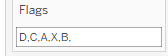
Step 2: The Parameter Data Source
We're going to be using a string parameter to store the flags and the order they have been removed from the population. We'll show how to dynamically populate this later. For now we just create the Parameter called [Flags] and populate it with a sample comma seperated list of the flags:
Step 3: The Sort
Establishing the order of the removed flags is key, and we do that in the below calculation. Because the flags are single strings the FIND calculation finds their position and we simple divide by 2 and add 1 to account for the commas:
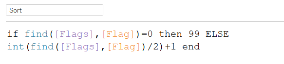
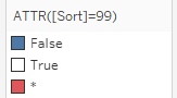
The [Sort] for each flag tells us whether it's been removed, if it is 99 then it hasn't been removed.
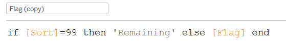
Step 4: Bucket up the flags that haven't been added yet
We'll call these 'Remaining' so we can visualise the remaining accounts in our viz.
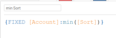
Step 5: For Each Account Establish when it was removed (if it has been) by finding the minimum sort.
An LOD will do this
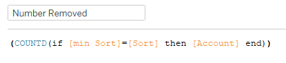
Step 6: Calculate a measure that tells us how many accounts have been removed
We'll use this at the flag level of detail later in our viz:
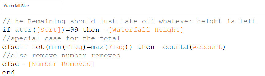
Step 7: Build the waterfall height variable
Our viz will be constructed as below, as a Gannt, so we need to work out the height / top of each bar:
We do that using this complex looking calculation:
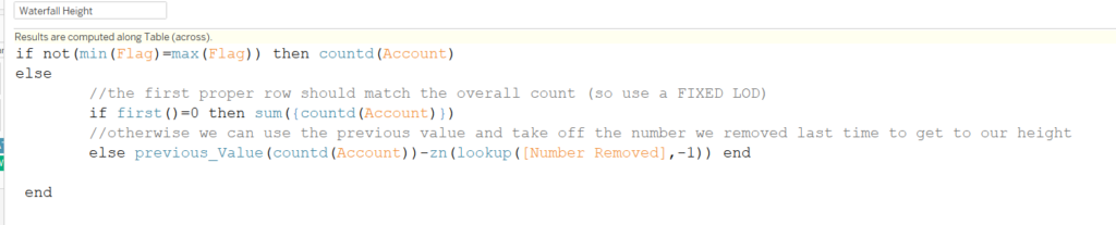
The comments should help break it down. The calculation starts at the left and works across the flags by sort order so it's worth looking at this bit first:

The height of the first column (not including the grand total) will always be the total number of accounts - i.e. the countd(Accounts). The other rows will always be the height of the last column, minus the number removed by the last flag.
The last two rows to deal with are the 'remaining' column, and the Total column. Both of these contain multiple flags and so unless we deal with the remaining column first in our IF we can't identify the Total row.
The remaining flags all have a sort of 99 and so: if attr([Sort])=99 will identify those, their height will just be the same as the other rows: the height of the last column, minus the number removed by the last flag.

That leaves the total row, now the only other row where min(Flag)=max(Flag), hence why we dealt with the remaining rows first:

At this point you're perhaps feeling a bit lost - work through the calculations in the workbook along with this article, again another Jonathan Drummey blog post might help with understanding that min(Flag)=max(Flag) bit:
http://drawingwithnumbers.artisart.org/customizing-grand-totals-part-2/
Step 8: Waterfall Size
The waterfall size is easier, and after the above should make sense:
Step 9: Build the Chart
Building the chart shoudl now be easy, both Table Calculations move across the Table along Sort and Flags Copy.:
Step 10: Add Colour
The colour is simply a quick calculation (with the total in red taking advantage of having multiple flags and so showing as an asterisk for the attribute):
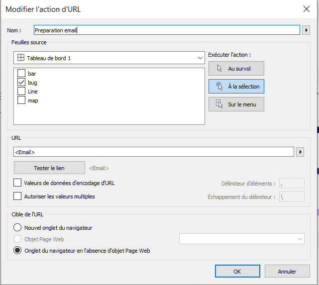
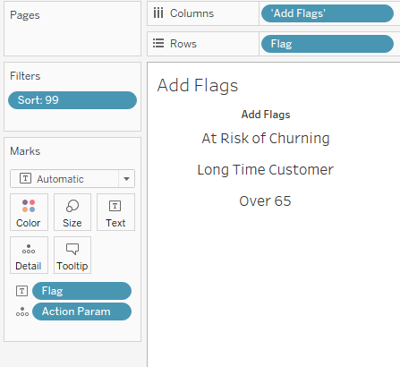
Step 11: Creating a 'Add Selection' sheet
A separate sheet to add the flags to the parameter (Add Flags in my workbook) is now required to add interactivity and drive the parameter.
To do this we create a simple calculation that adds the flag clicked to the end of the current list:
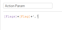
Then build a Parameter Action:
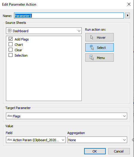
In the sheet we only show those flags with Sort=99 so that we're not including added flags.
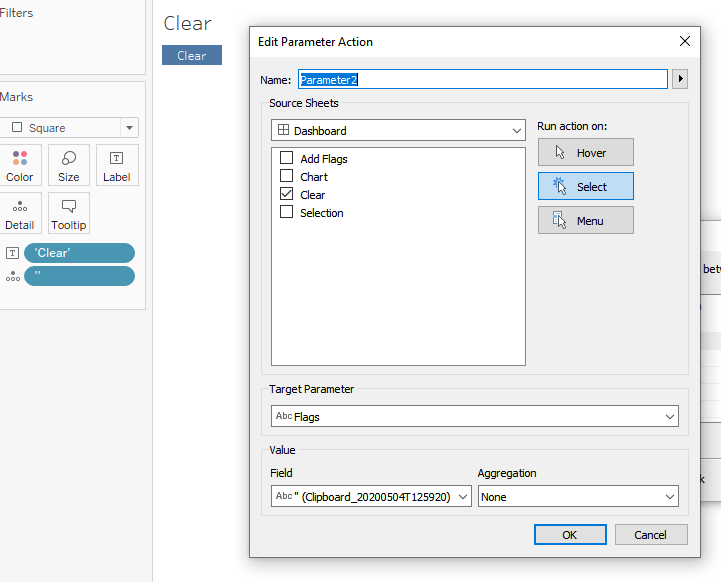
Step 12: Adding a Clear Button
The clear button is very similar except uses a parameter action to add a blank string and replace the Parameter:
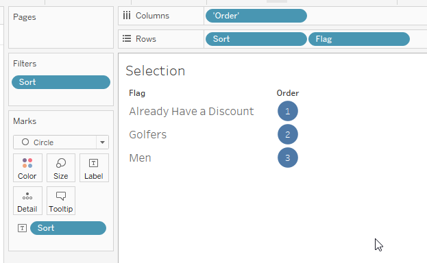
Step 13: Adding a Selection Screen
The final (non dynamic) screen just shows the selections and their order:
That's all - hopefully if you've made it this far you're not too bamboozled! Have fun building and investigating the chart and hopefully you've learnt some new techniques along the way.
A link to the finished visualisation again:
That's all - hopefully if you've made it this far you're not too bamboozled! Have fun building and investigating the chart and hopefully you've learnt some new techniques along the way.
A link to the finished visualisation again:
[iframe src='https://public.tableau.com/views/DynamicOrderedWaterfall/Dashboard?:display_count=y&:origin=viz_share_linky?:embed=true&:display_count=yes&:showVizHome=no&:toolbar=yes' width='10000px' height='800px' scrolling='no']https://public.tableau.com/shared/3HFG7S8KH?:display_count=y&:origin=viz_share_link