

Neither Tableau nor Power BI make it particularly easy for you to create dynamic titles for charts, particularly when changing the default options that appear if you were to select all of the values possible (or none at all). Numerically, these are slightly easier (essentially using the ZN function to turn any nulls to 0s, and then formatting differently), but strings are a different matter entirely.
Tableau
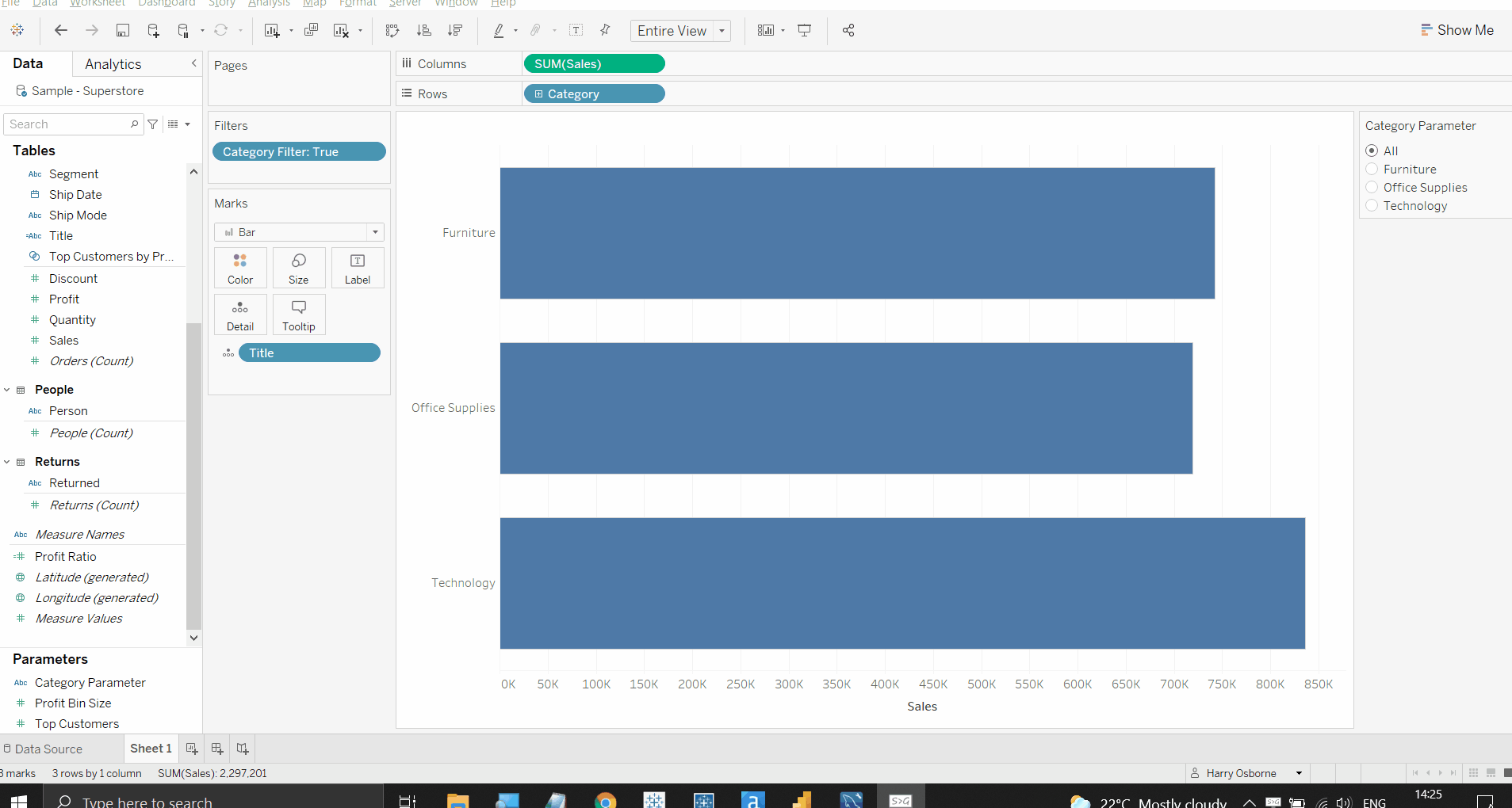
Imagine in Tableau you have a simple bar chart showing the sum of Sales for each Category (I am using a sample Superstore dataset in both examples). I want to alter my view so that clicking on an individual bar will filter to that category, but also alter the title to reflect only the category being viewed. Further to this, I want all of the bars to return when I click on the selected bar a second time, and at the same time alter the title to reflect that no specific category has been chosen at that time.
Individually these features are not too tricky, but together can be a pain; this is compounded by Tableau’s default response when using fields in titles, where it will simply display “All” or “None” if everything/nothing is selected, without giving you the option to change this.
The first step to circumvent these obstacles is to create a parameter. In this parameter I selected string and auto-filled the categories themselves (there are only three different categories in Superstore), plus I added one more option named ‘All’. Next, I created a Category Set - in this set, I selected all of the available values (i.e. all three of the categories), and left it at that. This set effectively forms the chart that will be returned if the ‘All’ parameter option is selected - all of the categories will be returned as a result.
The next step involved making some calculated fields to operate the dashboard. First, ‘Category Filter’, which looked like this:

This was to be placed on the Filters shelf, as it created a Boolean (True/False) result, and set to True. Based on the options of my parameter, this calculation would either filter for the set (which contained all of my categories) if they selected ‘All’, or it would filter for exclusively the selected category in the parameter (if they selected ‘Technology’, for example).
The second calculation was actually the key to achieving the dynamic title itself. This calculation looked at the parameter and would return a blank (denoted by the ‘ ‘ part of this calculation) if the ‘All’ option was selected - this is how we can avoid the default ‘All’ result from appearing in our title. However, if a category was selected in the parameter as well, it would return ‘Selected Category: [Category]’ instead - perfect!

Finally, having placed our new Title field on the details shelf and added it to the sheet's title, it was a case of setting the parameter action for the sheet. By using the settings shown below, the sheet would update to show only a single bar if selected, but also default back to the original view (i.e. three bars, one for each category) if selected again, all with the titles changing too.

Suddenly, our chart will now switch from three bars with no title showing, to to one bar with a far more useful title available.
Power BI
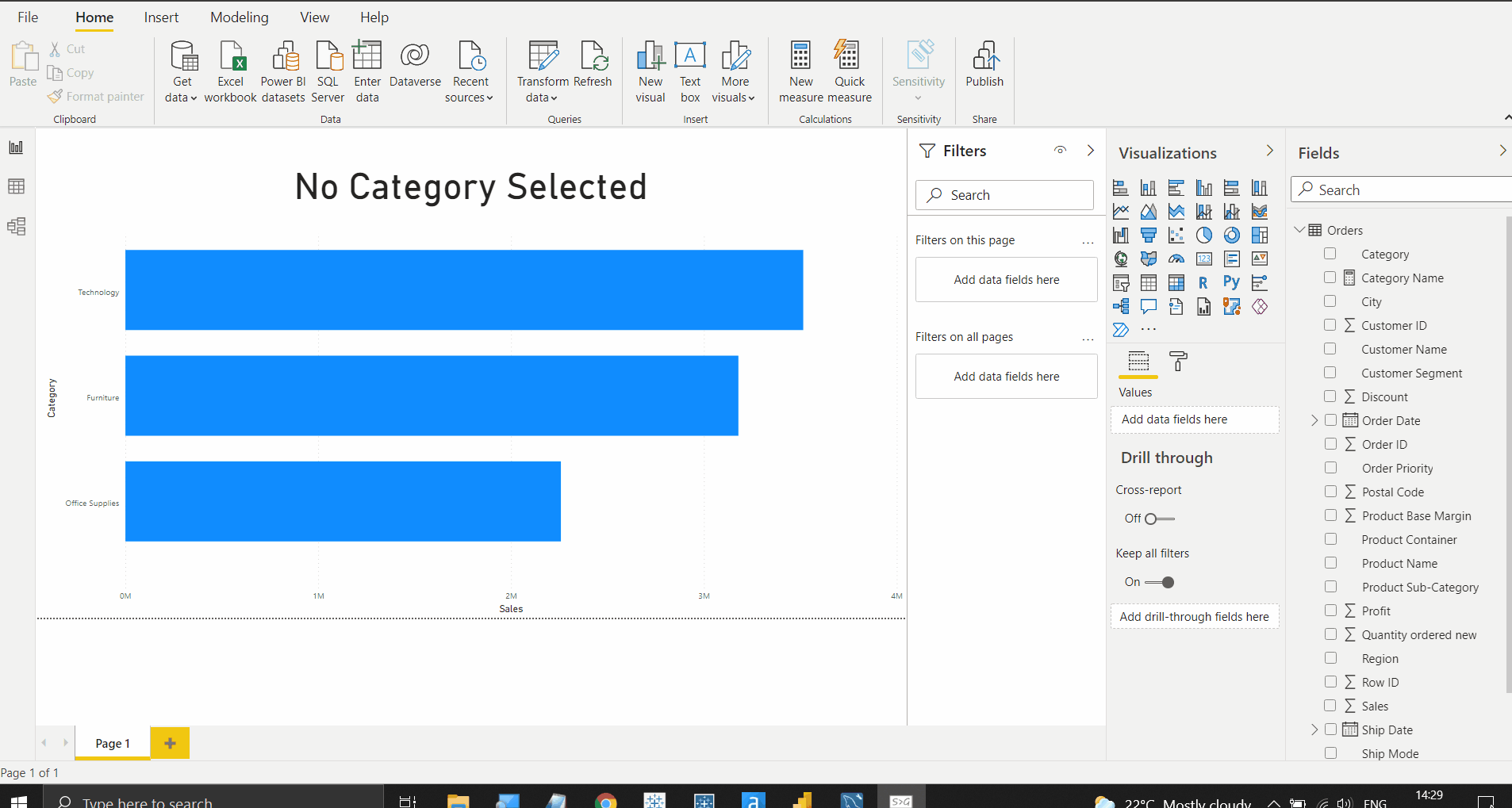
Power BI has a similar issue, but that when a bar is selected then deselected, the original selection will be retained. This can obviously be misleading and not very intuitive, given that Power BI has recognised the selection (as will be reflected in the numerical values on the charts), but not the reverse action as well.
Power BI’s solution is quite a lot more straightforward. Beginning with the exact same bar chart and measures, if I were to bring in a Card into the same view (with that Category field included), it would bring back whichever category has been most recently selected every time.
Using an IF statement in a new measure, we can replace this Category field on the Card, and this will return the correct values. The calculation is as follows:
Category Name = IF(
ISBLANK(
SELECTEDVALUE(Orders[Category])
),
'No Category Selected',
“Category Selected: “ & SELECTEDVALUE(Orders[Category])
)

What this calculation is doing in layman’s terms is, if Category is blank (i.e. nothing selected), then return the text “No Category Selected”. Otherwise (i.e. when a category is selected), it is returning “Category Selected:” plus the Category itself. Replacing the original field on the Card is enough to trigger this response (assuming your interactions are configured normally), and now your titles will update appropriately!
I hope this helps clarify an alterative method to renaming items in both Tableau and Power BI. These are both functions I feel should be significantly easier in these softwares, but require some navigation to achieve. Don't hesistate to contact me here or on Twitter (@harrylosborne) if you have any questions.