7 November 2014
The topic may seem strange at first sight though most of you must be familiar with the benefits of duplicating the data connection in Tableau. The prime use case is when we want to compare the details to a higher, summary level in the same visualization. What does summary and detail really mean? Let’s see a tangible example of a simple Excel file containing country level annual sales value data by manufacturer and brand (of manufacturer).Summary vs. detail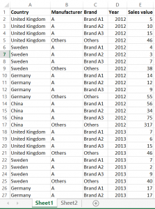 There is a one-to-many relationship between the fields ’Manufacturer’ and ’Brand’, namely many brands can belong to a manufacturer. The higher, summary level is ’Manufacturer’ and the detail is ’Brand’. You may have already noticed that this is practically a hierarchy, even if the hierarchy itself is not created in Tableau.The dashboard we prepareSticking to manufacturers and brands, let’s say that we are preparing a dashboard for a manufacturer – well, simply called ’A’. Their management asked us to put two charts and a table on the dashboard (please see below).
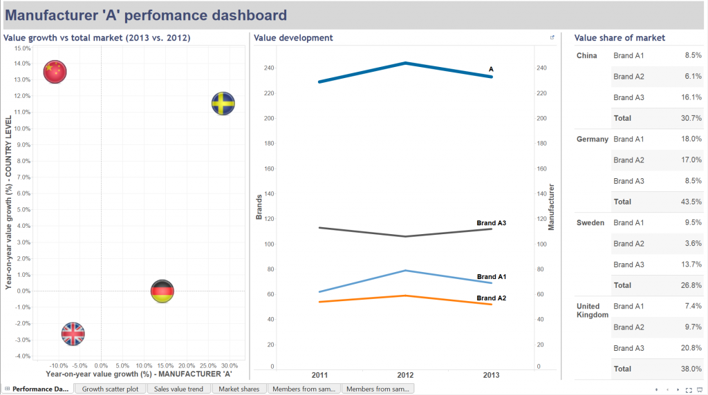 From left to right:- manufacturer ’A’s year-on-year value growth vs. the same for the total market by country- value development of the brands of manufacturer ’A’ as well as their total value evolution (2011-2012-2013)- the value share of brands (not split by year now, just an average for the three years)In how many of these views did we have to apply a duplicate data connection to the same data source? You are right, in all of them. The logic of the scatter plot starts with creating the annual sales values and then the year-on-year growth. This happens via three calculated fields.

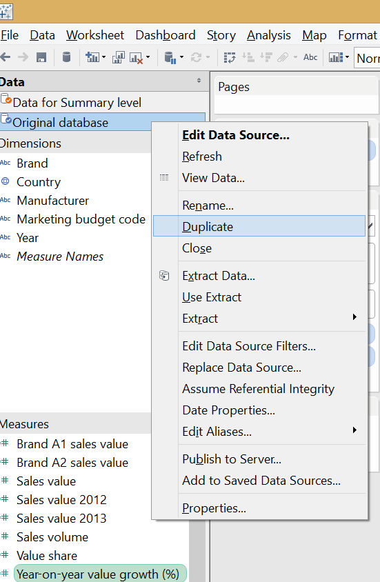
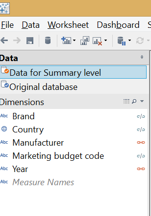
 To be able to place the year-on-year value growth (%) field twice in the view (to form both axes) but to refer to different levels of the data, the original data connection had to be duplicated. The below image already shows the end result of duplication: a new data connection in the data window that I named 'Data for Summary level' to distinguish from the original and indicate the level of information we take from there.
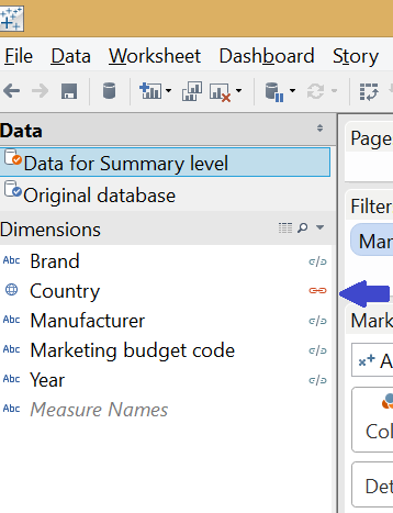
 The two data connections had to be blended to make a relationship between them. As we want to see the growth rate on the vertical axis on total country level without any further split or detail, the blend is created on the ’Country’ field only.
 The 'Manufacturer' field ('A' selected) also has to appear on the filter shelf applying to the horizontal axis, where the growth rate is taken from the primary data source (Original database).The line chart follows a similar analogy. The measure here is ’Sales value’ and we duplicate it by using the same duplicate data connection to our initial data source. The measure from the second data source refers to the manufacturer level. The chart is then set to be dual axis with the axes synchronized. The graph in this initial format does not carry country level information so we blend the secondary data connection on ’Manufacturer’ and ’Year’.
 The market share table on the right side of the dashboard also utilizes the duplicate data connection but in a slightly different way. Every ’share’ has a nominator and a denominator. In this case the nominator is the brand level sales value while the denominator is the market level sales value. You already recognize the ’detail vs. summary’ pattern here as the market level sales value serves as the ’summary level’ data. The market share formula is:
 In this worksheet the secondary, duplicate data connection is blended along the field ’Country’ only because we are not interested in annual figures (that would involve blending on ’Year’ also) or share of brands not within the total country’s sales but within their manufacturer (blending on ’Manufacturer’, too). Should we be interested in this latter option and blended the view also on ’Manufacturer’, the result showed the brands' ratio in the respective manufacturer’s sales only, not within the total market (total country).Later a filter action was added to the dashboard, pointing from the market share table to the sales value trend, carrying the selected ’Country’ as the filtering field.
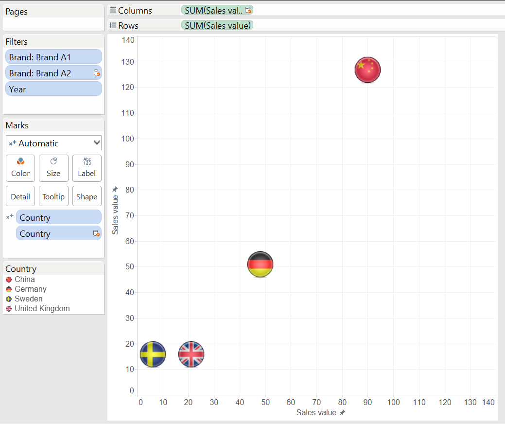
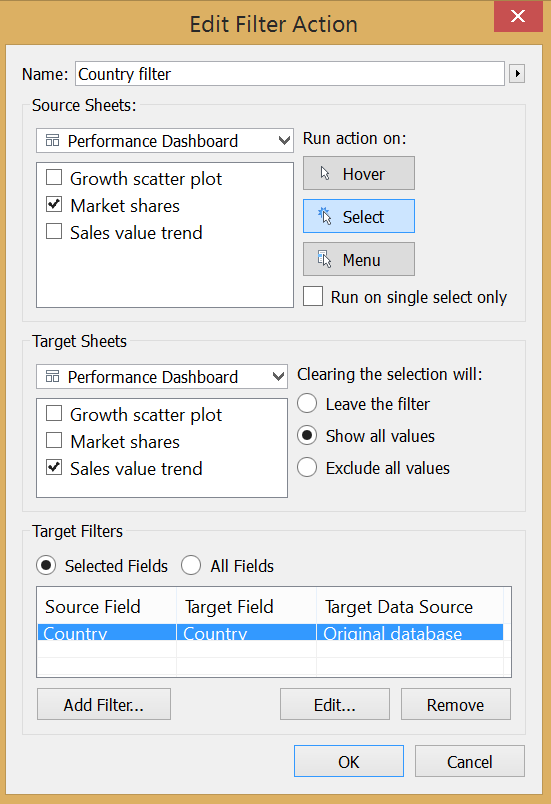 This means that we have to revisit our blending in the line chart and blend on ’Country’, too. Otherwise the data coming from the duplicate source would always show Manufacturer ’A’ sales value in total of all countries.An additional point to using a duplicate data connection with share calculations is the flexibility of this solution. Imagine that you have e.g. brand level performance measure (like sales volume or sales value) and want to calculate the brand’s share within various geographical hierarchy levels (country, region) or various product markets (within a manufacturer or a product segment or the full product category). This is all possible with one formula and one visualization via blending the data at the appropriate level. So you will always blend in the view the desired aggregate level of data from the duplicate data connection.We have discussed three cases of duplicating the data connection and in one of them we needed to include the duplicate in a calculated field, too. Let’s revisit our scatter plot now. What if we want to display two members of the same dimension on the two axes, instead of having two different dimensions (the detail and the summary)? Concretely, let’s include the value sales of Brand A1 and Brand A2 in a similar scatter plot and arrive to this visualization. This chart enlightens us on whether Brand A2 tends to sell more if Brand A1 is already selling well in a country. It indicates the correlation between the two brands' sales.
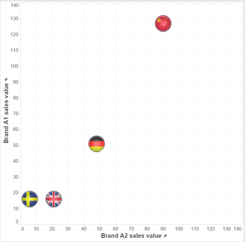 Do we need a duplicate data connection? No, we can extract the sales value of Brand A1 and Brand A2 from the Sales value measure the following way and build the scatter plot with these new calculated fields.
 An almost identical calculated field extracts Brand A2 value from the Sales value measure.Still, just for the sake of experimenting this can also be done with a duplicate data connection. The ’Sales value’ measure will be selected from both and we filter on Brand A1 from the original connection to the database and on Brand A2 from the duplicate. Data are blended on ’Country’ and ’Year’ from the two connections. We arrive to an identical solution.
 All in all, if possible it is better to solve a visualization challenge with a single data connection, not complicating our lives with data blending and possibly slowing down our report.To download the workbook please visit Tableau Public by clicking on the image below.
 There is a one-to-many relationship between the fields ’Manufacturer’ and ’Brand’, namely many brands can belong to a manufacturer. The higher, summary level is ’Manufacturer’ and the detail is ’Brand’. You may have already noticed that this is practically a hierarchy, even if the hierarchy itself is not created in Tableau.The dashboard we prepareSticking to manufacturers and brands, let’s say that we are preparing a dashboard for a manufacturer – well, simply called ’A’. Their management asked us to put two charts and a table on the dashboard (please see below).
 From left to right:- manufacturer ’A’s year-on-year value growth vs. the same for the total market by country- value development of the brands of manufacturer ’A’ as well as their total value evolution (2011-2012-2013)- the value share of brands (not split by year now, just an average for the three years)In how many of these views did we have to apply a duplicate data connection to the same data source? You are right, in all of them. The logic of the scatter plot starts with creating the annual sales values and then the year-on-year growth. This happens via three calculated fields.

 To be able to place the year-on-year value growth (%) field twice in the view (to form both axes) but to refer to different levels of the data, the original data connection had to be duplicated. The below image already shows the end result of duplication: a new data connection in the data window that I named 'Data for Summary level' to distinguish from the original and indicate the level of information we take from there.
 The two data connections had to be blended to make a relationship between them. As we want to see the growth rate on the vertical axis on total country level without any further split or detail, the blend is created on the ’Country’ field only.
 The 'Manufacturer' field ('A' selected) also has to appear on the filter shelf applying to the horizontal axis, where the growth rate is taken from the primary data source (Original database).The line chart follows a similar analogy. The measure here is ’Sales value’ and we duplicate it by using the same duplicate data connection to our initial data source. The measure from the second data source refers to the manufacturer level. The chart is then set to be dual axis with the axes synchronized. The graph in this initial format does not carry country level information so we blend the secondary data connection on ’Manufacturer’ and ’Year’.
 The market share table on the right side of the dashboard also utilizes the duplicate data connection but in a slightly different way. Every ’share’ has a nominator and a denominator. In this case the nominator is the brand level sales value while the denominator is the market level sales value. You already recognize the ’detail vs. summary’ pattern here as the market level sales value serves as the ’summary level’ data. The market share formula is:
 In this worksheet the secondary, duplicate data connection is blended along the field ’Country’ only because we are not interested in annual figures (that would involve blending on ’Year’ also) or share of brands not within the total country’s sales but within their manufacturer (blending on ’Manufacturer’, too). Should we be interested in this latter option and blended the view also on ’Manufacturer’, the result showed the brands' ratio in the respective manufacturer’s sales only, not within the total market (total country).Later a filter action was added to the dashboard, pointing from the market share table to the sales value trend, carrying the selected ’Country’ as the filtering field.
 This means that we have to revisit our blending in the line chart and blend on ’Country’, too. Otherwise the data coming from the duplicate source would always show Manufacturer ’A’ sales value in total of all countries.An additional point to using a duplicate data connection with share calculations is the flexibility of this solution. Imagine that you have e.g. brand level performance measure (like sales volume or sales value) and want to calculate the brand’s share within various geographical hierarchy levels (country, region) or various product markets (within a manufacturer or a product segment or the full product category). This is all possible with one formula and one visualization via blending the data at the appropriate level. So you will always blend in the view the desired aggregate level of data from the duplicate data connection.We have discussed three cases of duplicating the data connection and in one of them we needed to include the duplicate in a calculated field, too. Let’s revisit our scatter plot now. What if we want to display two members of the same dimension on the two axes, instead of having two different dimensions (the detail and the summary)? Concretely, let’s include the value sales of Brand A1 and Brand A2 in a similar scatter plot and arrive to this visualization. This chart enlightens us on whether Brand A2 tends to sell more if Brand A1 is already selling well in a country. It indicates the correlation between the two brands' sales.
 Do we need a duplicate data connection? No, we can extract the sales value of Brand A1 and Brand A2 from the Sales value measure the following way and build the scatter plot with these new calculated fields.
 An almost identical calculated field extracts Brand A2 value from the Sales value measure.Still, just for the sake of experimenting this can also be done with a duplicate data connection. The ’Sales value’ measure will be selected from both and we filter on Brand A1 from the original connection to the database and on Brand A2 from the duplicate. Data are blended on ’Country’ and ’Year’ from the two connections. We arrive to an identical solution.
 All in all, if possible it is better to solve a visualization challenge with a single data connection, not complicating our lives with data blending and possibly slowing down our report.To download the workbook please visit Tableau Public by clicking on the image below.