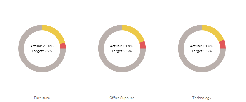
Donut charts aren't everybody's cup of tea, but I quite like them for showing a percentage against a total which has to be 100%. Things like the percentage of tickets answered within an hour, or an industrial test pass rate as a percentage, or an on time percentage.
The problem is that percentages often come with targets. If you're measuring a rate, you're probably measuring it to check that you're on target. For example, if you've got 19.8% of tickets being answered within an hour, you've probably also got a target of 15% or 20% or something, and you'd probably want to show that on your donut chart for context, like this:
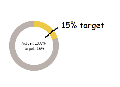
In Tableau, you can't do that, not without creating some pretty filthy trigonometric calculations. But I've recently found a workaround which I rather like, which I'll explain in this blog. You can download the supporting workbook from Tableau Public here.
I've used Superstore, which isn't too ideal for percentages and targets, but hey, it's something everybody uses. Let's say you're the head of sales for California. You know you're a big market, and you want to keep it that way - you want 15% of all of Superstore's sales to be in California.
You can create donut charts showing this percentage easily by creating two fields. One called [California Sales], which is:
IF [State] = 'California' THEN [Sales] END
The other would be [Rest of US Sales], which is:
SUM([Sales]) - SUM([California Sales])
And you'd put it on a donut chart with those two fields as the two measure values, then put measure names on colour, and split it out by category to get something like this:
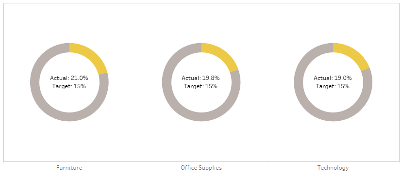
Sadly, we can't put a reference line at the 15% mark to show the target. Not easily, at least. But what we can do is to play around with the colours. If the percentage is above the target, we could show the percentage up to the target in yellow, and then the overperformance in green, like so:
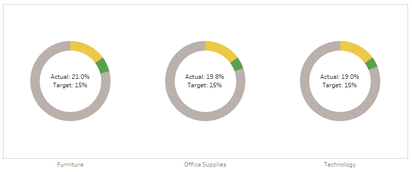
And if we adjust the target higher, we could show the percentage up to the actual percentage in yellow, and then the underperformance in red, like so:

This is a little complicated. It requires a few extra calculations; [California Sales Percentage], [Target Distance], [California Sales Base], [Rest of Sales], [California Sales Over], and [California Sales Under]. Let's go through the logic one by one.
[California Sales Percentage]
In this calculation, you take the existing [California Sales] field that you've made, and found out what that is as a percentage of all sales. It's simply:
SUM([California Sales]) / SUM([Sales])
[Target Distance]
This is how far from the target the California Sales Percentage is. I've used [Target] as a parameter to make it adjustable, but you could also hardcode it. It's simply the California Sales Percentage minus the target; so, if you've got an actual % of 21%, and your target is 15%, then the Target Distance will be 6%. It's simply:
[California Sales Percentage] - [Target]
[California Sales Base]
This calculation will be what's in yellow in the donut. If your California Sales Percentage is above the target, then you'll want it to be yellow up to the target, and then green above that, so this base field will simply be the target. If your California Sales Percentage is below the target, then you'll want it to be yellow up to the actual sales percentage, and then red for the space between the percentage and the target. So, you can calculate it like this:
IF [Target Distance] > 0 THEN ([Target] * SUM([Sales]))
ELSE SUM([California Sales]) END
[Rest of Sales]
This is the bit in grey. If your California Sales Percentage is above the target, then you'll want it to be grey from the actual sales up to 100%. If your California Sales Percentage is below the target, then you'll want it to be grey from the target value up to 100%. That can be calculated like this:
IF [Target Distance] < 0 THEN
SUM([Sales]) - ([Target] * SUM([Sales]))
ELSEIF [Target Distance] > 0 THEN
SUM([Sales]) - SUM([California Sales])
END
[California Sales Over]
This is the bit in green. If your California Sales Percentage is above the target, then you'll want it to be green between the target and the actual sales percentage. If it's below target, you don't want it to show up at all, so set it to zero like this:
IF [Target Distance] > 0 THEN
SUM([California Sales]) - ([Target] * SUM([Sales]))
ELSE 0 END
[California Sales Under]
Finally, this is the bit in red. If your California Sales Percentage is below the target, then you'll want it to be red between the actual sales percentage and the target. If it's above target, you don't want it to show up at all, so set it to zero like this:
IF [Target Distance] < 0 THEN
([Target] * SUM([Sales]))-SUM([California Sales])
ELSE 0 END
Okay! Now we're ready to build our donuts. This is the easy bit.
Build out your donuts like normal, like this:
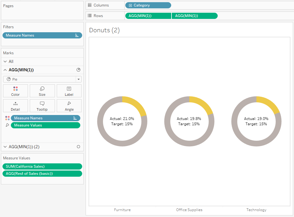
Now, instead of the current two measure values, we'll want all four of the colour ones:
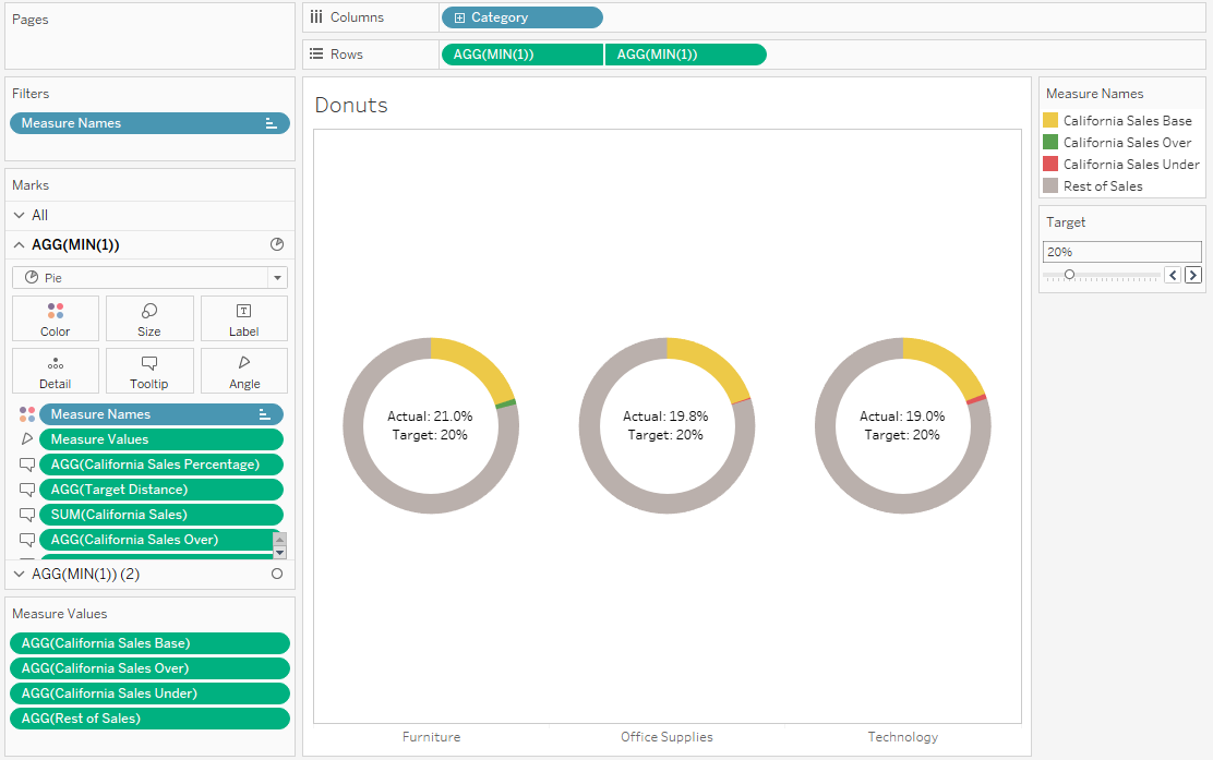
For this one, I've set the target to 20% so that there are examples of categories that are above and below target, all in one view.
And that's it! It's not quite a reference line, but it's a nice way of showing a percentage performance against a target within a donut chart. As a reminder, you can download my workbook here:
https://public.tableau.com/profile/gwilym#!/vizhome/Dynamicreferencebandingondonutcharts/Donutchart-dynamicreferencebanding
