
Authored by Chris Love. Feel free to chat on Twitter @chrisluv.
Looking through #MakeoverMonday I noticed a couple of Venn Diagrams this week. Venn diagrams are very popular, and audiences will be familiar with them, but are difficult to build in Tableau. What is more there are some great alternatives - especially when trying to build plots with more than 3 combination states.
UpSet Plots
UpSet plots are a great alternative to a Venn. While they may require some explaining to an audience they can quickly provide much more insight in a much smaller space and are relatively simple to build in Tableau.
Let's look at an example of an UpSet Plot built using some of the data from the wider data source in this week's Makeover Monday (Week 2, 2020).
The visualisation has three main elements. Firstly the combination dot plot on the left of the viz contains dots to show which countries/regions are grouped in each combination. The bar chart to the right showing the number of pesticides in this combination. The bar chart at the top of the combination plot shows the number of pesticides for each country/region.
We can quickly see the biggest combination is pesticides used in all four regions, which makes sense. We then note in the next two rows that there are a lot of pesticides that are approved in Brazil, China and the USA but not the EU, and also there are a lot that are only approved in the USA. Finding this information is simple as its right there at the top of the chart.
Building an UpSet Plot in Tableau
I recommend downloading the above example from Tableau Public (using the Share icon in the bottom right) to follow along and aid in understanding this tutorial and its calculations.
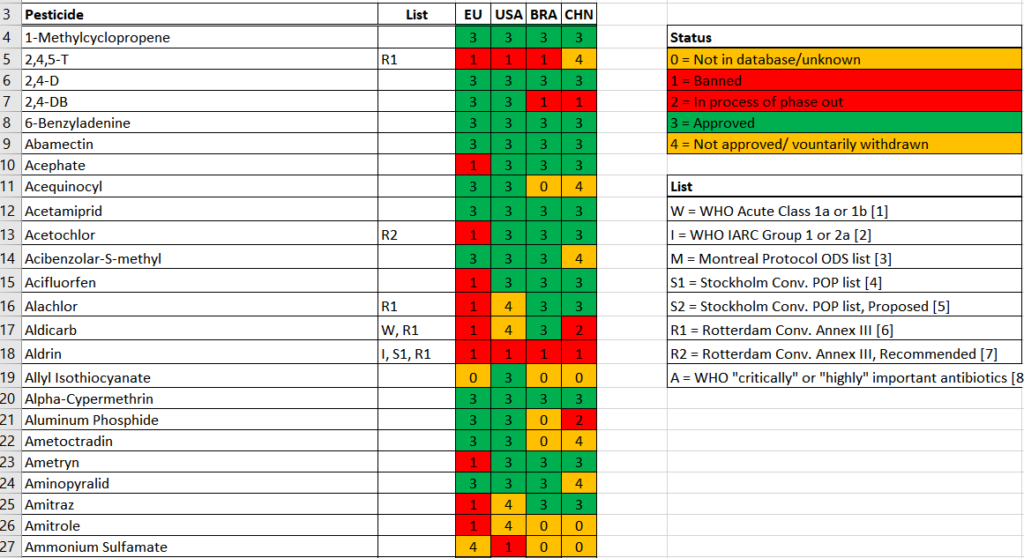
The data, above, is structured such that each row is a pesticide and the columns indicate its status in each region. Our first step in Tableau is to Pivot the data so that we have a row per 'Country'/Pesticide combination (from here I will refer to the EU as a country for brevity).
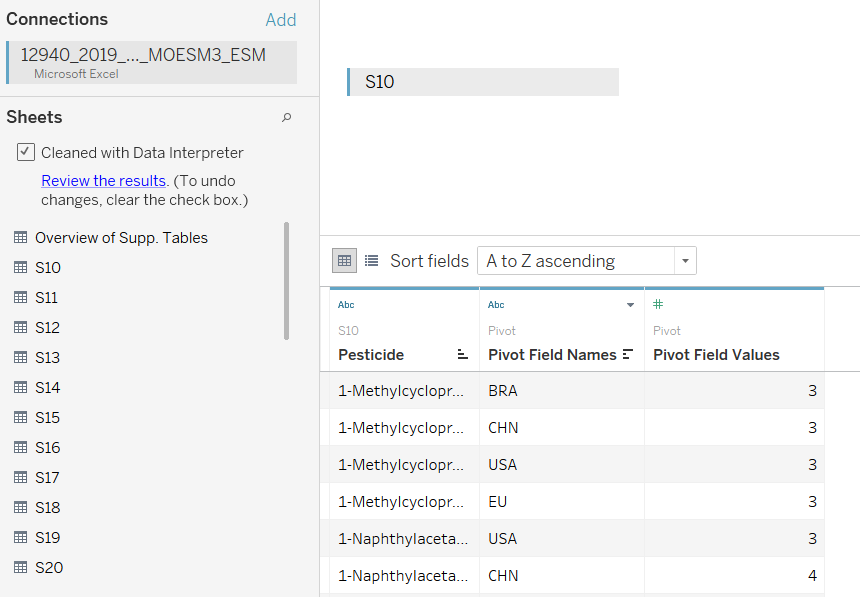
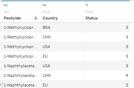
We then rename the fields to make them easier to follow later:
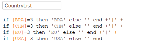
Our next job is to create some calculations that 'unpivot' the data too. We need both types. The calculations below will give each row in the data a column which indicates the status of each country.


Two more calculations are now needed to break up the combinations of Countries, and also to give each country a position in the combination plot - these two calculations will form the basis for that plot
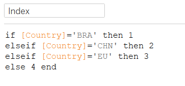
Note that Index should be a Dimension, not a Measure, as it will be used with aggregations and so move it up to the Dimensions area.
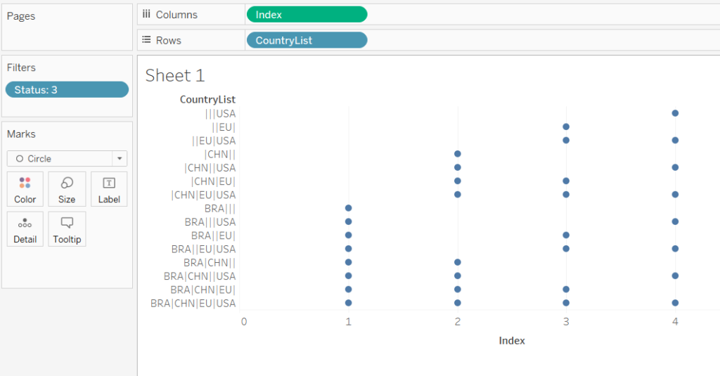
Now we can build our first plot, as below - note the Mark Type is set to circle and that we have filtered our status to 3, i.e. the approved pesticides:
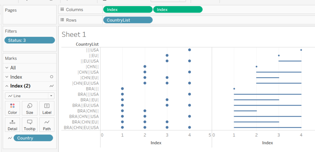
Now to add the lines: duplicate Index by holding down the Ctrl key and move it to the right of itself. Now change the Mark Type of this second Mark to Line, and drop Country onto Path to link up different countries with a line.
Our final step should be to clean up the visualisation by making the Index a dual-axis and syncronising the axis.
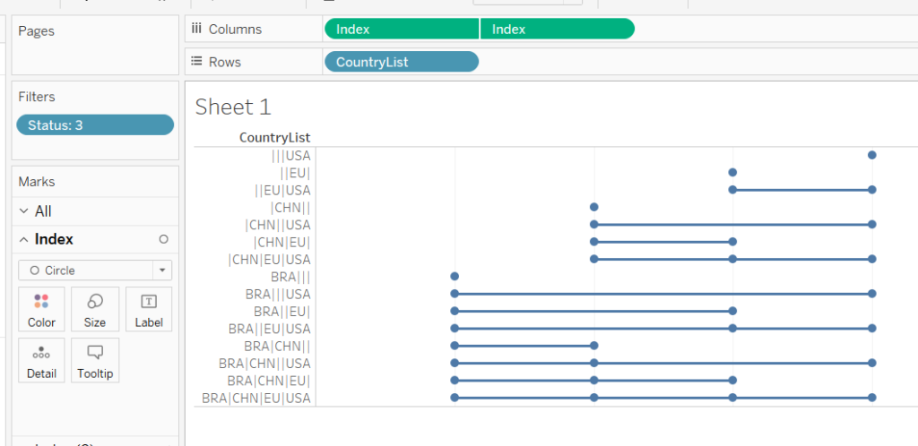
Our last step here will be to order the Pesticides by adding a discrete pill to the right of [CountryList] that orders them in descending order, in my case I use an inline calculation -CountD([Pesticide]).
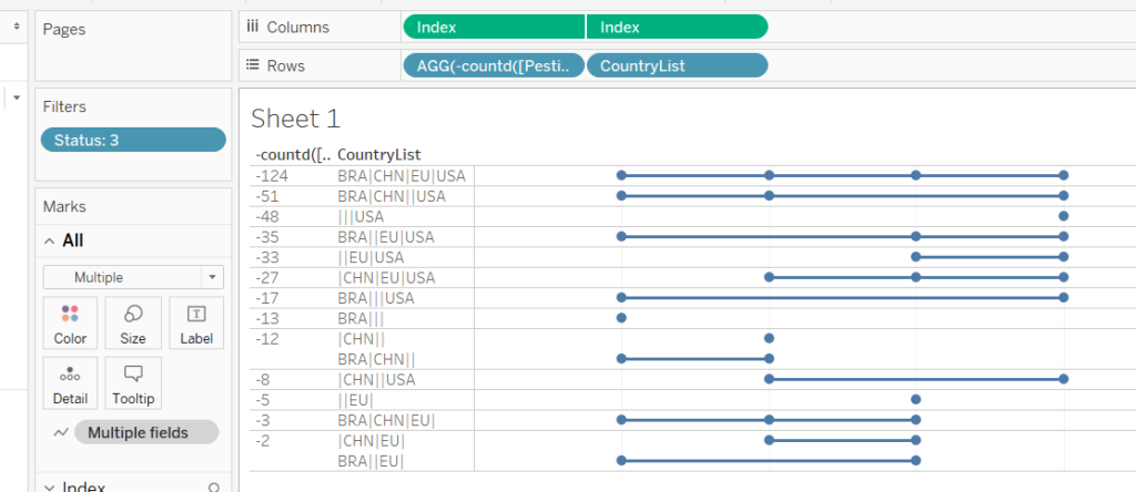
We'll tidy this up later, in the meantime we can create our other two charts, which are much easier.
First our horizontal bar chart, using the same sorting trick:
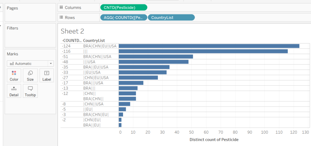
And our Vertical Bar Chart
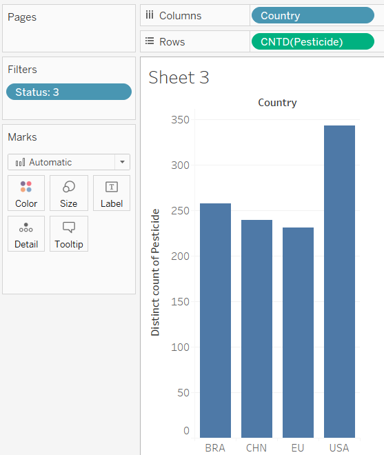
Now we simply need to combine them. I use a floating horizontal container to line up the two bottom charts and float the vertical chart above them:
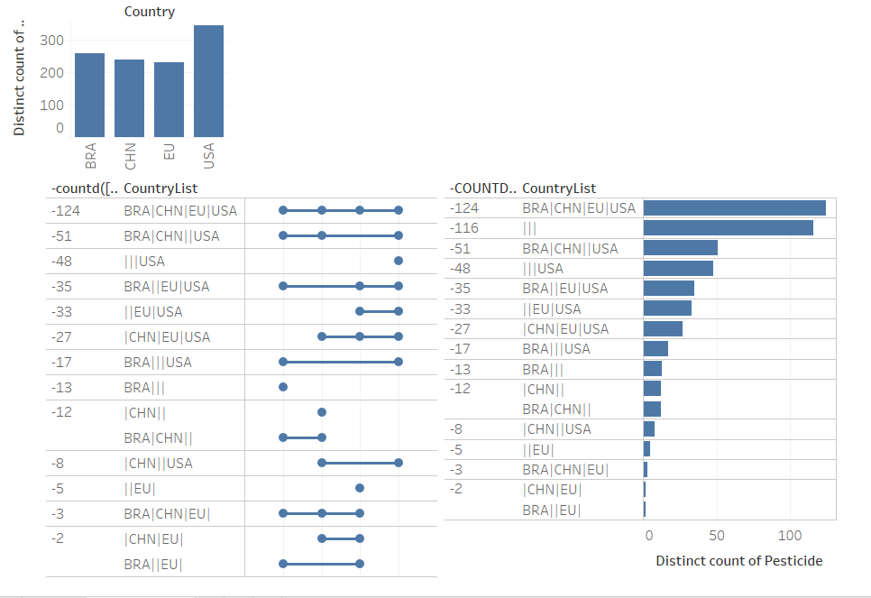
You'll notice the headers don't quite line up due to the Empty group in the bar chart - remove it.
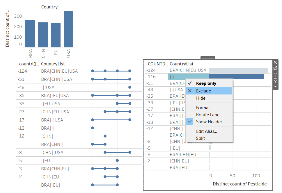
Now hide the headers and remove the axes
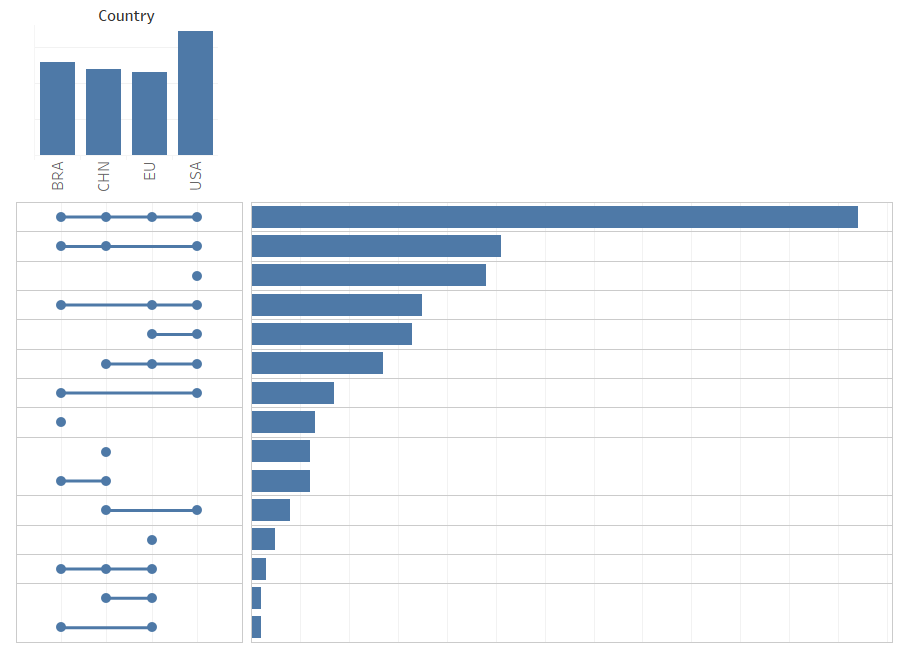
Finally, add labels and make the dots bigger, finishing with a Title (remember to tidy the tooltips).
You can also, if time permits, add interactive elements using parameter controls if you wish - I won't provide instructions, that is left as an exercise to the reader who wishes to download the chart from Tableau Public.
