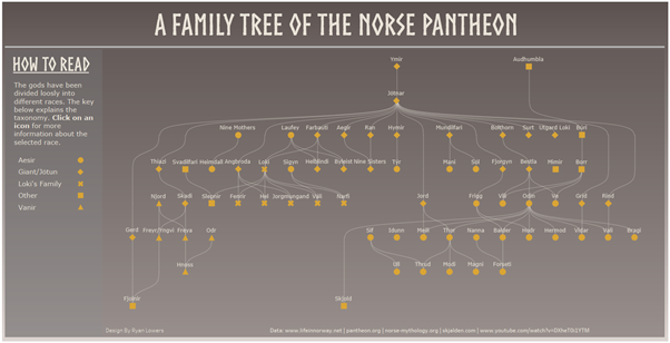
In this blog I’m going to provide a detailed guide about how I created an interactive family tree using Tableau. Though a base level of familiarity with the tool will certainly make things easier, my aim is to make this guide as easy as possible to follow so that anyone could pick this up and build their own family tree. I will be including steps on how to format the data all the way through to building out the visualisation.
My motivation for creating this visualisation was to submit an entry for the monthly IronQuest community project. The topic was on Myths and Magic and seeing as how Norse mythology has always been an interest of mine, I decided to create a viz around that topic. In the spirit of trying to keep things as simple I settled on the idea of creating a family of the gods in the Norse Pantheon.
Background
Making a family tree within Tableau is a bit tricky to say the least and my first port of call was to do some research to see if there was anything that would help me along. I came across a blog by Jeffrey Schafer show different ways to create a node tree link diagram in Tableau (I’ve included a link to this here) and this formed the backbone of what I ultimately created, the curved lines were a nice aesthetic touch and more functionally, the hierarchical nature of the chart made I perfect for my use case.
In his blog post Jeffrey refers to the chart as a Node tree link diagram and there’s one key but of information that it’s important to understand before trying to build the chart. When I first read it I found it a bit confusing, and it only really clicked when I was trying to reverse engineer the chart, so I’ll try to break it down as simply as possible beforehand so that others don’t have the same issue.
As the chart is hierarchical, each section will be assign a level, starting with the root node which is the point that all nodes originate from. In addition to this there are two fields T and T2 which control how the lines between nodes are drawn.
T: This will always count from -6 to 6 going up in increments of 0.25
T2: For the root node this will be equal to T but then with each successive level 12 will be added. So for level 1 T2 = T+12, for level 2 T2 = T+24 etc. With that clarified we can then begin to look at what our data for the nodes and connections will need to look like.
The data
The best way to think about the data, at least to start with, is that each row represents the connection between two nodes. For each node, we want to have name which I’ve called category, a tier which indicates the level of the node and then value for location of the node on the X-axis, as the y co-ordinates will increment equally between levels. Below I’ve listed the fields along with their descriptions.
Category – this is a field that acts as a label saying which to nodes are being connected.
Tier – the level in the chart that the first node in the connection appears.
Start Point – This is the x coordinate of the first node in the connection.
End Point – This is the x coordinate of the second node in the connection.
Label 1 Race – The race of the entity in the first node.
Label 2 Race – The race of the entity in the second node.
Label 1 Description – A description of the entity in the first node.
Label 2 Description – A description of the entity in the second node.
Child Num - A field that I use to number the children coming from each parent node. This is used later on in de-duplicating nodes.
The benefit of using this type of input is that is actually quite straightforward to populate. It’s a case of just entering which nodes are being connected together, the tier of the starting node, the start and end point of the connection and then labels and descriptions for each node. That being said it is quite a manual way of generating the data.
There are also a few quirks of the data that I was using that are worth mentioning, because certain gods fathered entities on multiple tiers, I needed to make us of placeholder values in certain connections. If I had not done this then in instances where a God had descendant on more than one tier, then that god would end up with more than one node to represent them in the chart.
My workflow
The workflow that generates my data for Tableau has been built in Alteryx and I will now explain each section of it. I’ve included a zipped version of the workflow at the end of this blog as well. For those that don’t have Alteryx I’ve included and excel template, and it’s still possible to build the required data, it just means a lot more copying and pasting.

Alteryx
I begin with three different inputs: my list of connections, my list of tiers and my table containing the T and T2 values for the root node.
Using an append fields tool I duplicate the T and T2 values for each tier, and then with a formula I add the calculation T2 = (12*Level) +T2. This will mean that for the root node T and T2 are equal. For Level 1 T2 = T+12 and so on.
I then use a filter to isolate data relating to each individual tier, and this is repeated for the connection list and the T values. For each tier I then use an append fields tool so that every unique record in the connections table is duplicated for each value of T and T2 for the appropriate tier. After doing this for all tiers the outputs are then unioned together again.
I then split out the category field to get a name for the first and second nodes in the connection, cleanse out any unnecessary white space and remove unnecessary columns. At this stage I also add a step that gets the list of labels for all of the first node in every connection and concatenates them into a single cell, which is then appended onto every row.
I also create specific inputs for nodes that need to appear in the family tree but do not have any descendants or ancestors. One of the labels for these will be a placeholder and then I use append fields to duplicated the data for every value of T and T2 for the relevant tier, and then a sample to ensure I only get the first row.
Excel
Generating the data for the visual using excel is quite straightforward but requires a lot of copying and pasting. Using the connections template sheet, enter in all the connections that will appear in the chart. For each connection be sure to fill in the Child Num column as well, and give a number to each child coming from a given parent node. The next step is to duplicate each connection for every value of T and T2 for the relevant tier and store these records in the combined data tab. The text to columns feature in excel can be used to split the category column in labels for the first and second node in the connection and the CONCAT function can be used to combine values for the first node label into a single cell. Call this column Pos 1 Label Check.
Tableau
Once all of the data has been prepped it’s time to dive into tableau and begin building out the chart. I would recommend using Jeffrey Schafer’s template as a starting point as it has some examples built in already as well as the calculations that we’ll need to build the charts. The most sensible way of approaching this is to open the existing template in Tableau and then connect a new data source containing the family tree data. After that recreate the calculations that we need to build the chart in the newly connected data set.
Calculations
Curve – this is the calculation that will connect the nodes of our chart together. What this is essentially doing is drawing lots tiny marks between the nodes, that gives the appearance of a line. It makes use of the sigmoid function to make the line curve.

Points - this is the calculation that plots where the nodes for each god will be placed. The default version has mostly what we need already but because our use case is a bit specific as we need to try and label each of the points correctly and have a taxonomy for each god.

Building the Chart
And now to actually start building out the chart itself. Place the Sum of Curve onto columns and on rows add the sum of T2 and the points field. In the 'All' section of the marks card drag Category onto detail and then drag T. We do this so it will apply to both of the fields in row at once. As default T will be summed so we need to click the dropdown and select 'Dimension'.
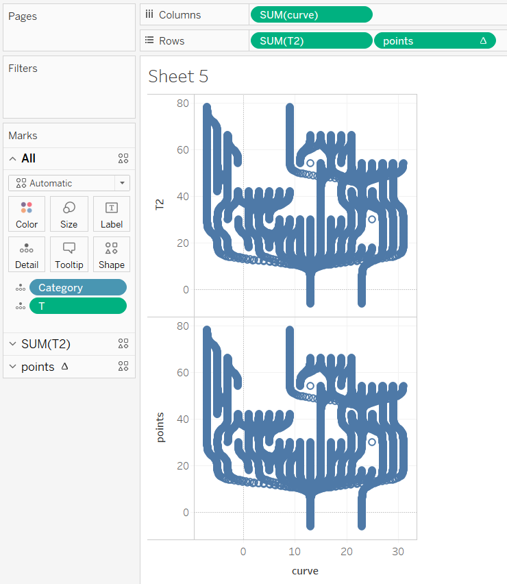
You should then end up with something similar to my example above. We want have one chart instead of the two that we currently have so we'll right-click one of the measures on rows and select dual axis. Next, as my charts are appearing upside down we need to double click each axis.
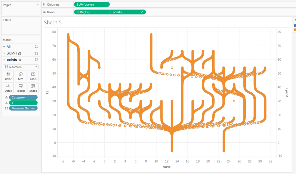
Because our chart is upside down click on either axis to open the menu and then select reversed. With 'All' still selected in the Marks Card ensure that Measure Names is not on colour. And then finally to get our chart looking a bit more like we'd expect we need to change the mark types of our two measures on rows. For T2 change the mark type to line and for points change it to shape. At this stage you should see the shape being duplicated all the way along the line and this is because we need to update the Table Calculation for the points measure so it knows how many nodes to draw. Right-Click on the points measure in rows and select 'Edit Table Calculation'. In the following menu select specific dimensions and then check the box for T. You should then have a chart that looks similar to the one below.
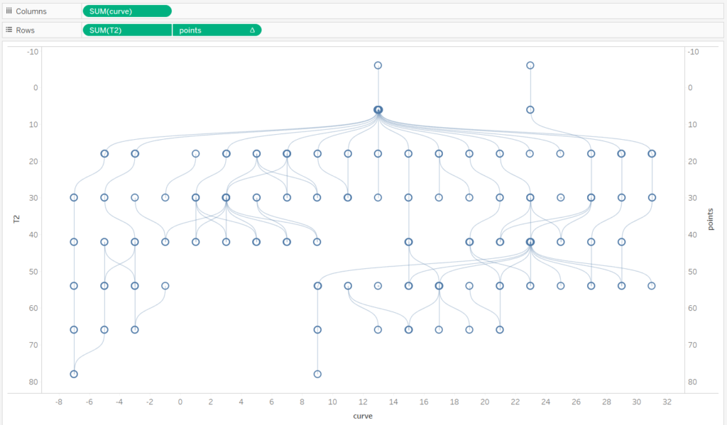
And now we are almost done with the building out our chart. While it may not be immediately obvious but what is currently happening with the points calculation is that for nodes with multiple children, there are many duplicate nodes being drawn on top of each other. This is an issue because it means we can't name our nodes correctly, so what we will do next is write calculations to deduplicate the nodes and then to name them correctly.
The first calculation we'll use is one that rewrites the points field to remove duplicates. A quick disclaimer here I arrived at this final calculation after A LOT of trial and error and in the end it seemed to suit my needs so I ran with it.
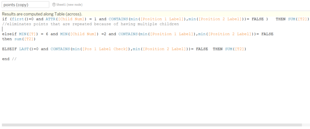
The general gist of this calculation is that using and if/else statement along with some of the fields we created earlier we are determining when a node should be drawn on the chart. To complete this step replace the points field on rows with out newly created points field, edit the table calculation and under specific dimensions check the box for T.
Our final calculation to name the nodes is much more straightforward, and consists of a relatively simple table calculation.
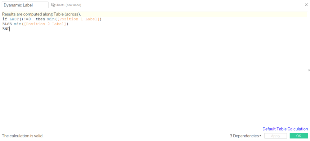
Once this field has been created select Points from the marks menu and add this field to labels.
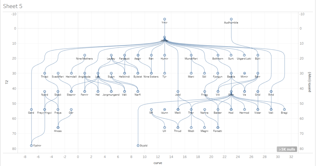
Wrap Up
And there we have it, follow these steps you should now have your very own family tree created in Tableau. Hopefully the steps that I outlined were simple enough to follow, but please feel free to make use of my Alteryx workflow or the Tableau Public version of my visualisation which you can find here.
