

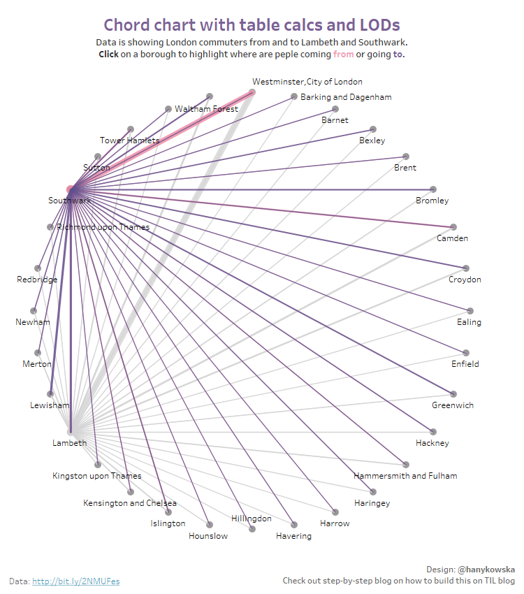
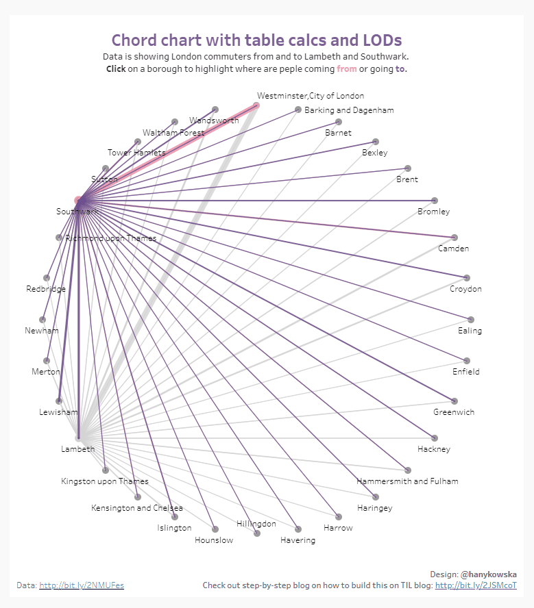
A chord chart (or schemaball) can be an interesting way to show how strongly two categories are related. Usually, they are pretty tricky to make and can require a lot of data prep that is not always available to everyone. This is the problem I have come across recently: the client wanted a chord chart but they don't have access to Alteryx (which would be what I'd use to build the shapes needed) so I thought I'd try and build this kind of chart with table calculations. I made it work and now I'm here to share it with you!
For the purpose of this blog, I'm using data on how many people commute between London boroughs (from place of residence to place of work)
Data
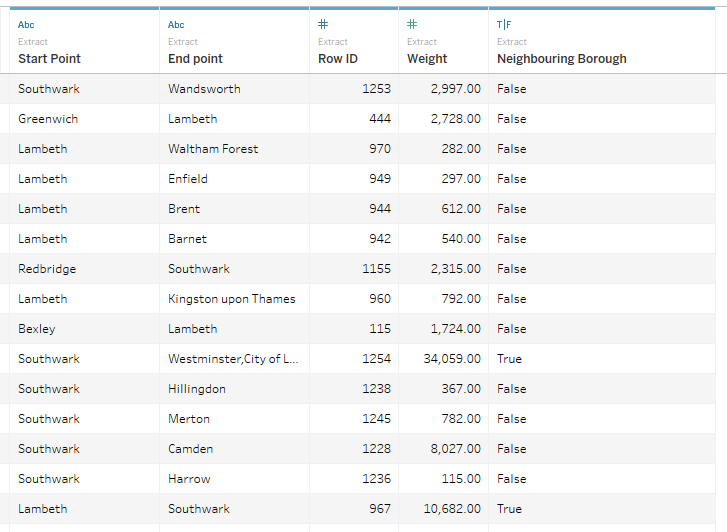
Let's be honest, the data will still need to be in the right format, but this format should be fairly sensible. Let's say you start with a data set that has a start point (Place of Residence), end point (Place of Work), and weight of the connection (Number of Commuters). To make the chord chart work, you will also need a row ID (actually it just needs something that can be used as an identifier for each connection). If it's something that you can get from your database, that's great. If you can't, create a calculated field:
Row ID (given [Start Point] and [End Point] are strings)
[Start Point] + [End Point]Formatting the data in Tableau
OK, so we have start point, end point, weight of the connection, and row ID. Lovely.
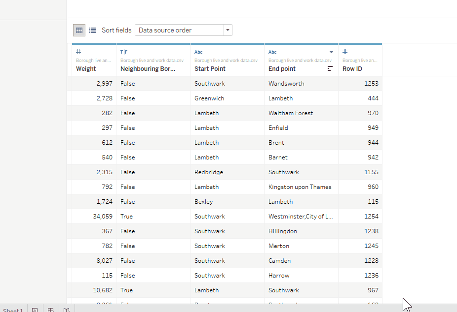
Highlight Start and End points, right-click → pivot. This will reshape the data so that all boroughs (in my case) will be in one column and there will be another column indicating if it's a start or end point. I renamed Pivot Field Values to Borough but you may decide to go with something more appropriate to your data:
Now, go to a new sheet and create a calculated field called Path - it will specify the direction:
If [Pivot Field Names]='Start Point'then 1elseif [Pivot Field Names]='End Point'then 2endThis field will by default end in Measures, leave it there for now.
That's it in terms of data prep!
Chord chart with Table Calcs and LODs!
This solution isn’t entirely straightforward and you may need to modify it to fit your data set. However, this guide will teach you the concepts required which you can pick up and modify to suit your needs.
With the data prep done, we’re ready to actually begin building the Chord chart in Tableau. If your data format differs significantly then you may need further table calculations. However, the steps below should work with data that is reasonably similar.
OK, let's get to it, shall we?
Point positions
First, we need to create a few calculated fields to find the right angle. What do we need an angle for? Tableau uses cartesian coordinates which is great for many types of charts. In order to build the chord chart, however, we need to have points placed on the edge of a circle. For this, polar coordinates work better - we only need angle and radius to find the position of a point. Thankfully, we can use trigonometry to translate polar coordinates into cartesian ones.

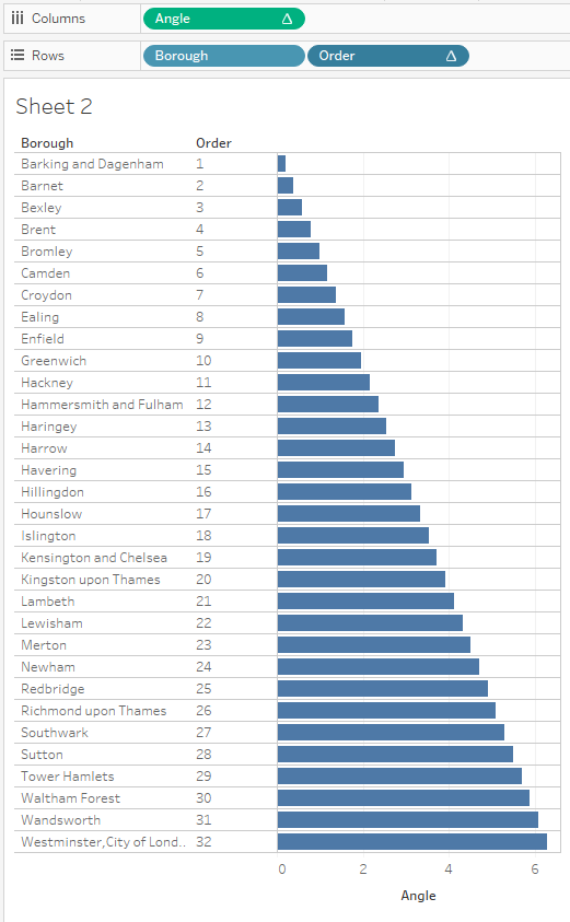
Let's create a calculated field called Total Positions - it will help calculate the smallest angle (1/[Total Positions]).
Total Positions
{COUNTD([Borough])}This will return the number of distinct positions you will have in the chord chart. I tried using a table calculation for it instead. That, however, turned to be much more complex to set up than using a fixed (on nothing) LOD instead.
Next calculated field will be Order and it's something to just assign a number to each position.
Order
INDEX()As you can see, it's just an INDEX function. (The trick will be to set it up correctly with all of the other calculations in the view! But worry not, I've got you covered.)
Now that we have [Total Positions] and [Order] we can finally add another calculated field, Angle.
Angle
( (2 * PI()) / max([Total Positions]) ) * [Order]There is quite a lot going on. Let's break it down. 2 π is a full circle (360°, tableau trigonometric functions use radians and so we need 2 π instead of 360°). Total Positions should have the same value for all rows in the data so it requires some aggregation, max() should be fairly computationally-light and will give us the right value. Full circle divided by all positions will return the smallest angle. Multiplying that by Order will give us the angle values for all positions.
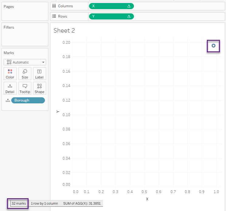
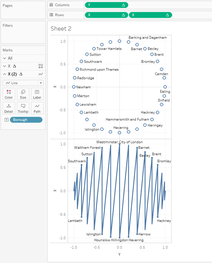
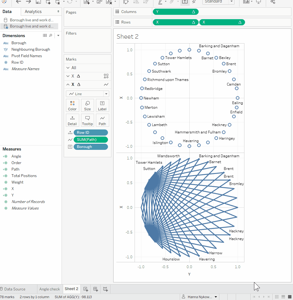
OK! We have our angles calculated. To check that the calculated fields work, drag Borough (or whatever you use to identify different positions) and Order to the Rows shelf, then drag Angle to the Columns shelf. The image below is what you should get. You may replace 2 π with 360° if sense checking is easier in degrees (it was for me!) but make sure to go back to radians before we continue. Another alternative would be to use ([Order] - 1) in the Angle calculation instead of [Order]. Then the first position would start with an angle of 0 and be in the middle as opposed to a few degrees to the right.
Now that we have the angles calculated, we can write translation calculations.
Looking back at the combination of polar and cartesian coordinates we need two fields:
X
cos([Angle])Y
sin([Angle])We can skip the radius because we want it to be the same for all points. Skipping the radius is equivalent to assigning it a value of 1.
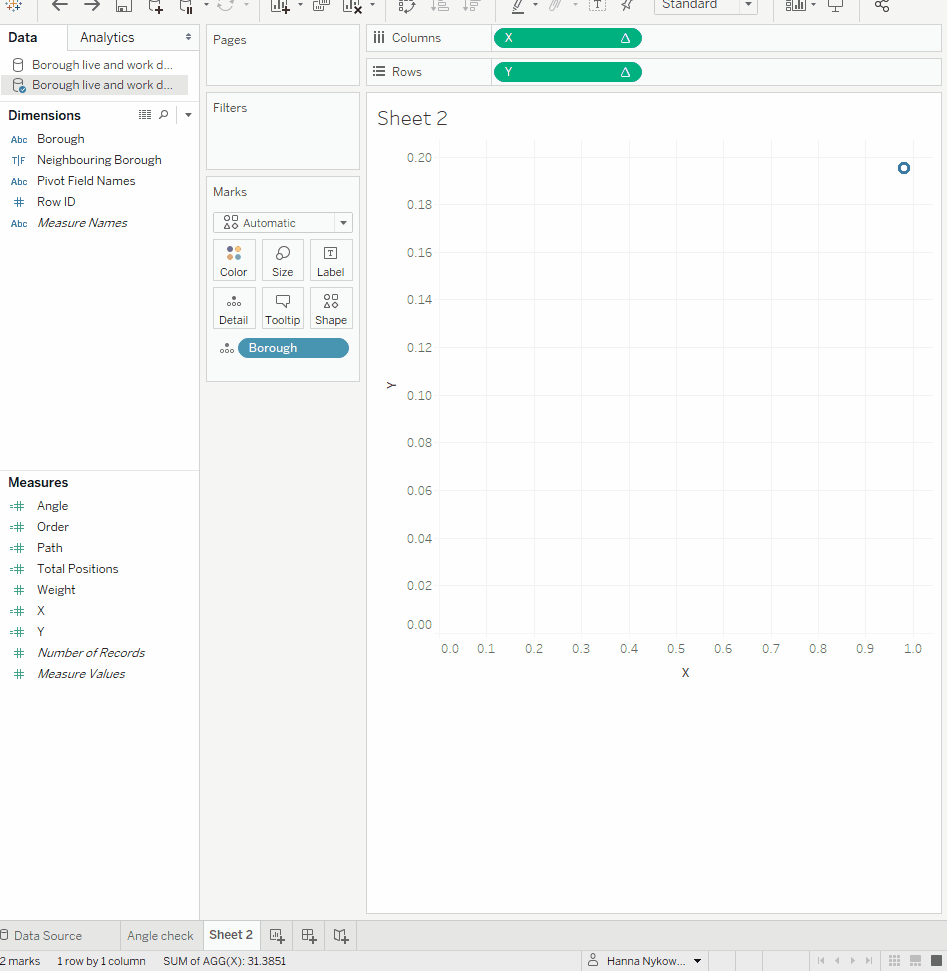
Drag X to columns and Y to rows and Borough to detail. This doesn't seem encouraging. We can see there are 32 marks but they all seem to be in the same place! Fear not, it's the table calculations that require setting up.
Right-click on X → Edit Table Calculation → Compute Using → Specific Dimensions → tick Borough (or your equivalent). This already should end up in a circle but repeat the same for Y. In the gif below, you can also notice that the positions are starting not from the top, like a clock face, but rather from 3 o'clock (horizontal axis) in the anti-clockwise direction.

To accommodate for the above, we simply need to swap columns with rows. For those who like a diagram, here's a comparison of the two:
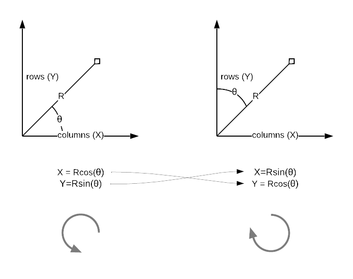
For the practical minds, just click Swap Rows and Columns or hit CTRL+W:

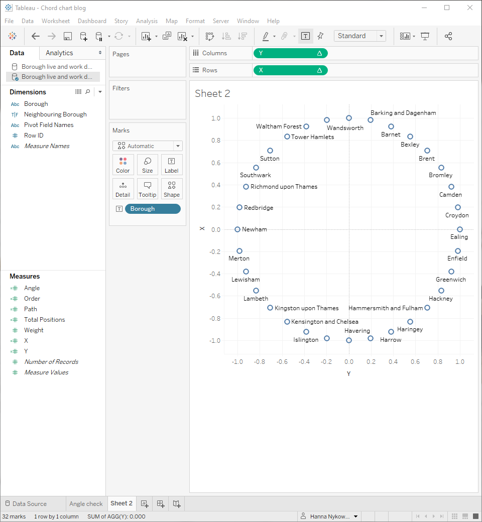
You can change the assignment of Borough pill from detail to text to show the labels.
Here's what I have so far:
Connect the dots
Great, the boroughs are in the right place. Let's now draw the lines between them.
Hit CTRL and drag pill X to the right of itself. Now you should have two X pills on rows. Change the mark type on X(2) from automatic to line. It may look like a mess but let's keep going.
On X(2) (line), drag Path onto Path (see what I did there) on marks card:
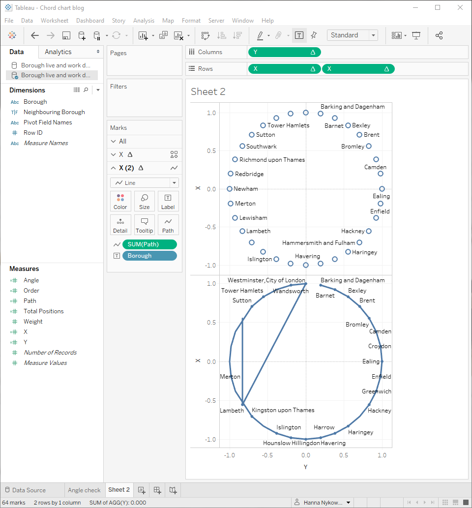
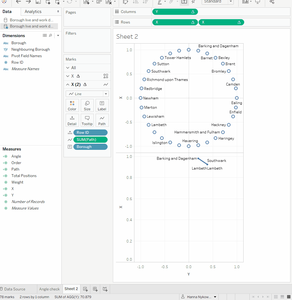
Now drag Row ID onto detail on X(2) marks card. Oh no! what happened to our circular points? Table calcs, that's what happened.
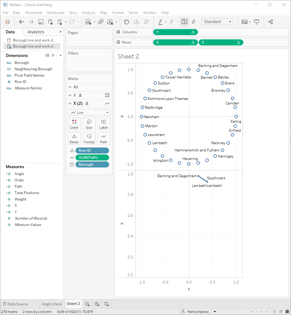
To fix that, right-click on the X pill on the right → Edit Table Calculation → Compute Using → Specific Dimensions → make sure both Borough and Row ID are ticked → At the level → Borough. Ta-da!
Alright, we're almost there. You already have dots for one axis, now let's do a dual-axis to combine the two views. Right-click on any of the X pills → Dual Axis. Then make sure you synchronise the axes and hide them. You may have noticed that the chord chart disappeared after selecting Dual Axis! Just remove Measure Names from colour (either on the marks card for line chart or on the marks card for All). Finally, change Borough assignment from Label to Detail on marks card for line chart.

Fun part - AKA formatting
Fantastic, we have our chord chart ready to be formatted! I’ll leave this part to you. However, in my example, you can see how I use weight to thicken chords with a strong connection and colour to highlight the direction of connections.
I have also joined my original (not pivoted) data to the pivoted data. Then I created a parameter from Borough and a calculated field to distinguish between from and to and connections that are not related. With parameter actions, you can now click on any of the circles to adjust the colouring for that borough. Pretty cool.
You can find my workbook on Tableau Public.