19 December 2016
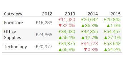
How to make people embrace data visualisation?When we find, ourselves being ‘the new Tableau kid’ in a world of Excel driven minds it is challenging to ‘unhook’ people from their beloved Excel tables.Even though your data visualisation enthusiasm and energy is well received or even appreciated, people will approach you and request a ‘beautiful table’. My first instinct was to try to fight it, to explain why a line chart is a better way to visualise trend over time, or a bar chart is good to see quantity by category at a glance, but I quick came to the realisation of why people say ‘If you can’t beat them then join them’. This blog isn’t about swapping data visualisation aids by excel tables or just to build tables for everyone, but it is about how to introduce data visualisation to new Tableau users, without making them feel that we are imposing it on them.My approach to this conundrum was to build a chart and a table within the same container and give the user an option to choose between the chart or the table by interacting with one parameter created.But then, how could I add visual aids to the table?This is where things got interesting. My approach was: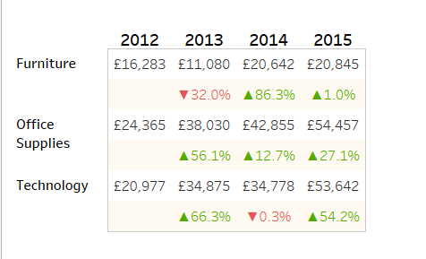 By using this rationale, I was not only able to create a table that would satisfy the requirements, but also, I managed to introduce simple visual aids that would improve the user experience.How to do it?
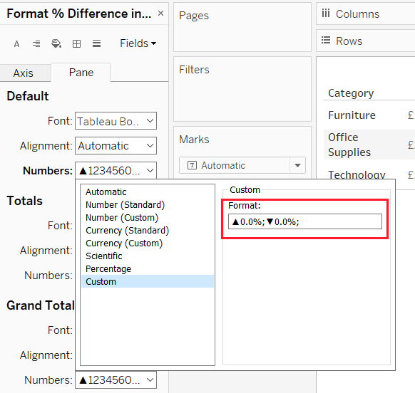 Note: Custom formatting in Tableau is based on Excel's custom format pattern, in which we can specify different formats (positive, negative, and zero values) by separating the formats with a semicolon.[positive];[negative];[zero]Here you can also add the decimal places by using a comma, i.e. (0,0%;0,0%;0,0%)
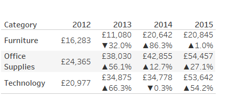 Use of Colour:
 How to move the headers up?
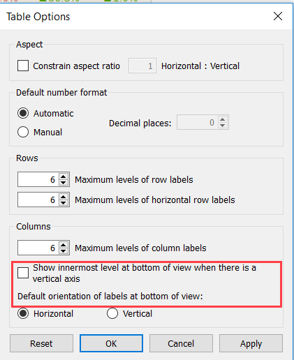
 Uncheck the: ‘Show innermost level at bottom of view when there is a vertical axis
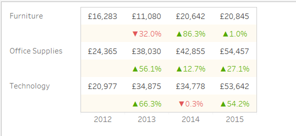
 The new table is done and the first baby step towards a more visual world is now complete.Keep tuned in, there are many more blogs to follow!
- Build a simple table
- Add Ascii symbols to show percent difference over previous month visually.
- Use colour to my advantage
 By using this rationale, I was not only able to create a table that would satisfy the requirements, but also, I managed to introduce simple visual aids that would improve the user experience.How to do it?
- To insert the arrows, click in the measure field—in this example, SUM(Profit)—and select Format.
- In the Numbers drop-down menu, select Custom, then copy the Unicode symbol (from a reference page) and paste it in the Format box
 Note: Custom formatting in Tableau is based on Excel's custom format pattern, in which we can specify different formats (positive, negative, and zero values) by separating the formats with a semicolon.[positive];[negative];[zero]Here you can also add the decimal places by using a comma, i.e. (0,0%;0,0%;0,0%)
 Use of Colour:
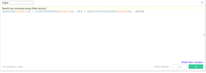
- Create a calculated field (with a Boolean) where the colour will show if one month had an increment or a drop in profit in relation to the previous month.

- Drag the new calculated field ‘Colour’ to the colour shelf, and…
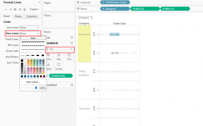
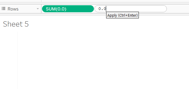
- On the rows shelf I created two (number of measure fields needed) dummy fields
- Double click on the shelf and write 0.0
- Duplicate the field on the rows shelf
- Add the categorical fields to the view

- Add the measures to the label of the ‘new charts created’
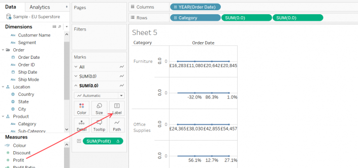
6. Change the mark type to text and format the charts to clear zero lines, borders and headers

- Drag the colour calculated field previously created to the colour mark on the respective chart card
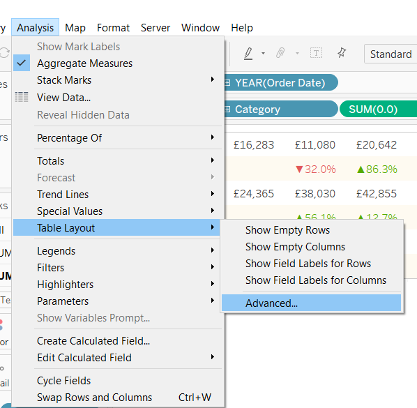
 How to move the headers up?
- Click on the analysis tab, from the drop down menu choose:
 Uncheck the: ‘Show innermost level at bottom of view when there is a vertical axis
and presto…
 The new table is done and the first baby step towards a more visual world is now complete.Keep tuned in, there are many more blogs to follow!