What are Z scores? How can you calculate them in Tableau? And once you've done that, what can you use them for? This blog will cover all of that, using some fake data from a factory that produces things. We'll have a look at how the things differ from each other across various different manufacturing dimensions, and use that to see what to do with the thing we're currently building. It's all in a Tableau Public workbook here.
Firstly, what's a Z score, and why would we want to use one?
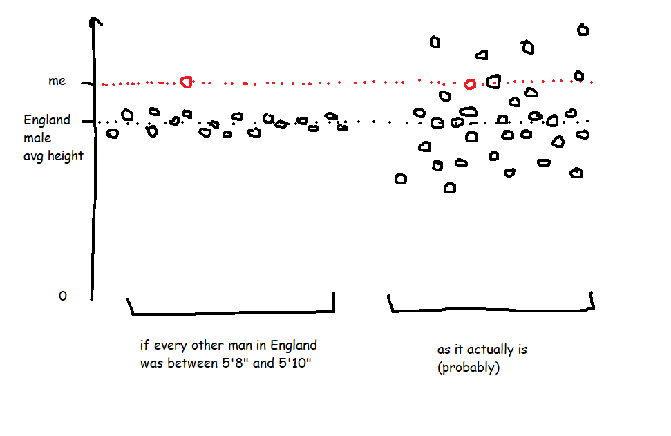
A Z score is a way of looking at how much more, or less, something is from average in a relative way that accounts for the spread of data. For example, let's start with height. I'm 6'3' (or 190cm), and I live in England, where, according to wikipedia at the time of writing, the average male height is 5'9' (or 175cm). That makes me taller than average.
However, averages don't tell you anything about the spread of data, which means that taking the simple difference in height doesn't tell you anything about how tall I am relative to everybody else. If every man in England (apart from me) was somewhere between 5'8' and 5'10', I'd be an absolute giant, relatively speaking. But as it is, I'm never the tallest guy in the room, so while I'm taller than average, I only feel averagely tall.

This relative difference from average can be expressed in a Z score, which is essentially saying, 'how many standard deviations above or below average is this value?'. A Z score is calculated like this:
Value - Average Value
/
Standard Deviation of Values
So, my height as a Z score compared to men in England would be:
6'3' - 5'9'
/
Standard Deviation of Heights (which I don't know)
In the hypothetical example where every other man is between 5'8' and 5'10', the spread of heights is small, which means that the standard deviation of heights would be really low, which means that my Z score would be really high. But in the real world, the spread of heights is much greater, so the standard deviation of heights is bigger, which means that my Z score is lower.
It also means you can normalise comparisons over different metrics with different scales. Let's say I'm an Olympic heptathlete. I'm doing seven different events, and the units they're measured in are different - some are in metres, like the high jump and the shot put, and some are in seconds, like the hurdles and the sprints. The scale of those units is different too - I'll be able to throw the shot put many times further than I can jump. That makes comparing my performance across my different events difficult! But Z scores let you compare. If my shot put Z score is +2.1 compared to other athletes while my hurdles score is -0.3 compared to other athletes, I know that I need to work on my hurdles more than my shot put.
OK, so Z scores are a way of normalising data to do comparisons. How do I do it in Tableau?
Sets are fantastic for this. Here's a quick explanation of why before we move onto how to set it all up.
I like using sets to decide which things I'm focusing on (the 'I want to know how normal this thing is' group) and which things are in my reference group (the 'I want to take this lot as the basis for all my comparisons' group).
A lot of the time, you'll want all things to be in both groups. For example, if I'm a professional athlete, I want to compare myself to my peer group, and I'll want to see how my closest rivals compare to the same peer group too. So, I'd stick all the top athletes in my sport in the main group (so I can see their Z scores) and in the reference group (so that I'm comparing everybody to each other).
Actually, I'm very much not a professional athlete... but when I'm out cycling, I might still want to compare myself to the Tour de France pros to see just how out of my league they are. In that case, I'd want all the professional cyclists in the reference group, and I'd want to put myself in the main group, but what I don't want to do is put myself in the reference group - my slow trundling up Anerley Hill would only bring the reference group's average performance down and widen the reference group's standard deviation, and I'd mistakenly make myself look closer to the pros than I actually am.
That's why I like using sets and set actions in Tableau. Now for the actual Tableau work!
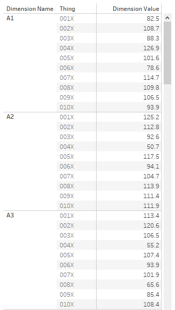
First of all, let's talk data structure. I've got a long and thin data source; a field for the [Dimension Name], a field for the [Thing], and a field for the [Dimension Value]:
OK. The next step is to set up the sets. I want to create two sets based on my [Thing] field - one for the main analysis set, one for the reference set. You can do this by right-clicking on [Thing] and selecting Create Set.

Now that I've got two sets, I can start creating my Z score calculations. The formula for a Z score is:
Value of the thing you want a Z score for - Average value in the reference group
/
Standard Deviation of values in the reference group
You could do all this in one calculation, but I like breaking mine down into individual parts.
[Reference Set Avg]{FIXED [Dimension Name]: AVG(IF [Reference Set] THEN [Dimension Value] END)}
[Reference Set StDev]IF {FIXED [Dimension Name]: COUNTD(IF [Reference Set] THEN [Dimension Value] END)} =1 THEN 0 ELSE
{FIXED [Dimension Name]: STDEV(IF [Reference Set] THEN [Dimension Value] END)}
END
Now I can use those two calcs in my Z score calc:
[Z Score](AVG([Dimension Value]) - AVG([Reference Set Avg]))
/
AVG([Reference Set Stdev])
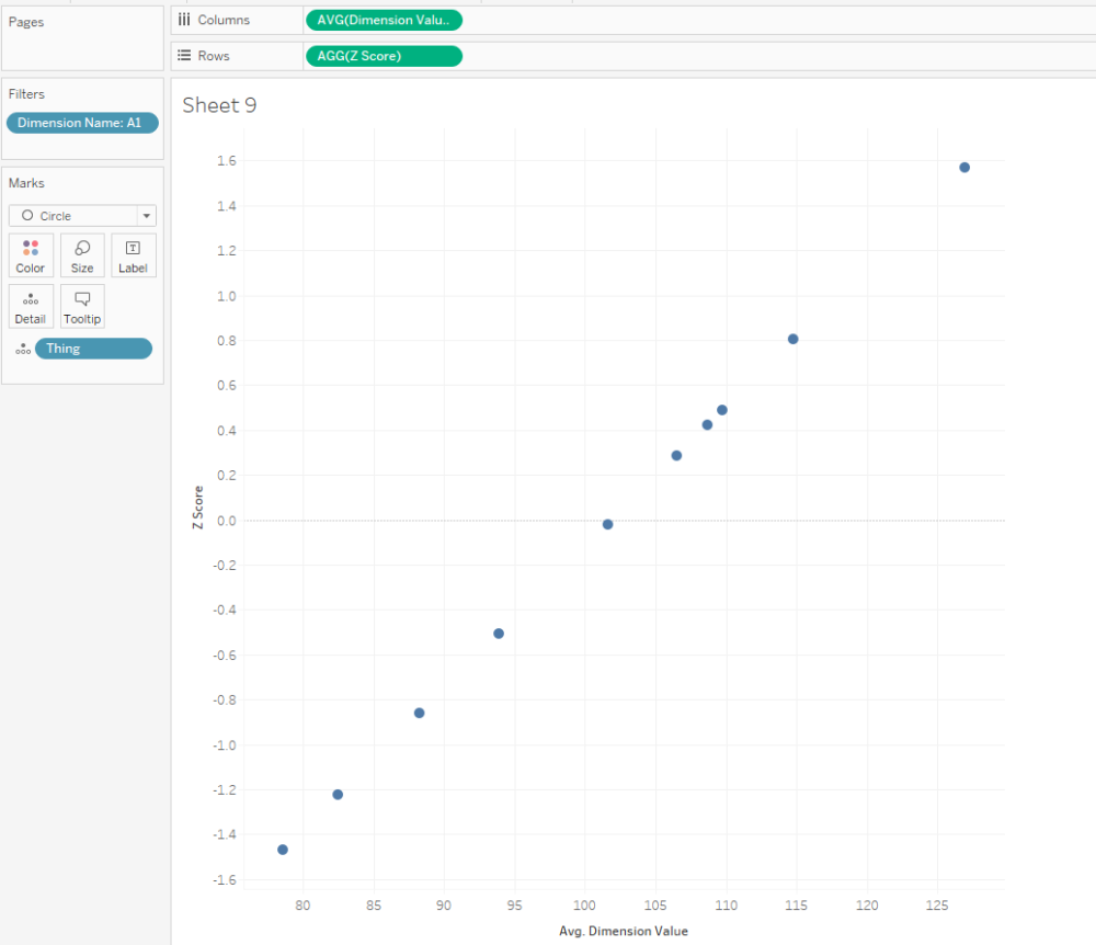
That's all it takes to calculate Z scores! Here's a scatterplot of my dimension A1. The actual dimension value and the Z score are perfectly correlated, but now we've got a normalised value on the y-axis:
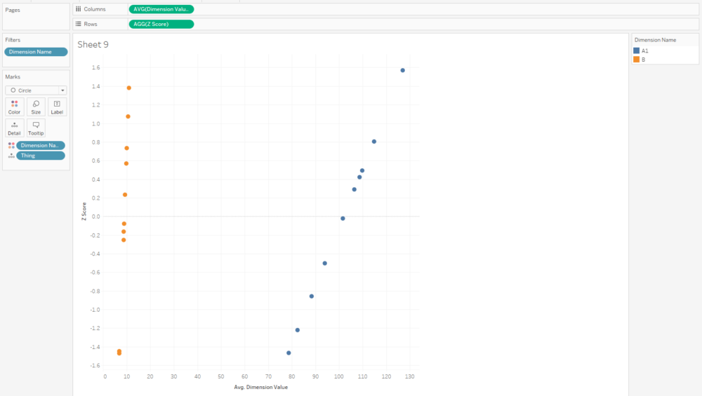
And that normalised value is nice and useful, because now we can compare two dimensions with very different scales, like A1 and B:
I often plot Z scores on diverging bar charts. A chart like this will show me how a thing compares to other things across multiple dimensions, and a thing's idiosyncrasies will stick out:
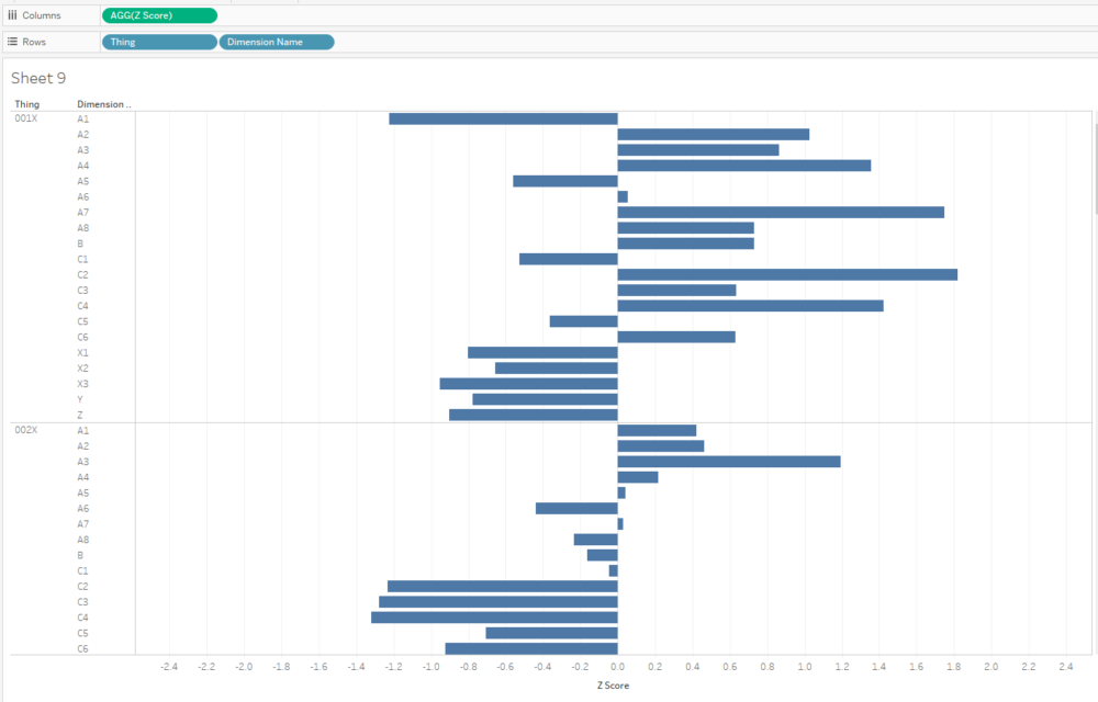
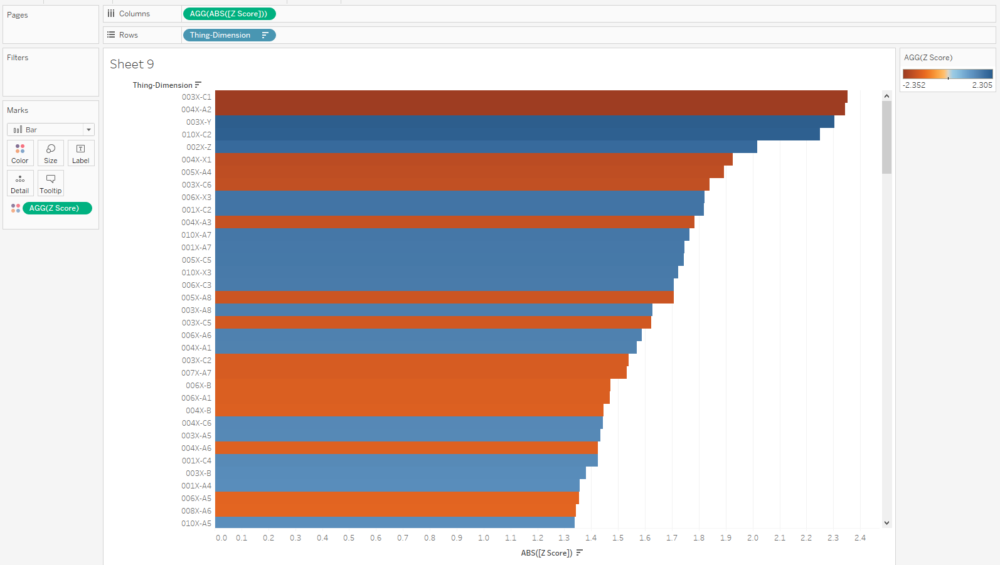
Similarly, if I want to see what the outliers are across a whole data set, I can create a concatenated [Thing-Dimension] field, plot the absolute Z score, colour by the actual Z score, and sort. This instantly shows me where the biggest outliers in my data are:
Eagle-eyed readers may have noticed that I haven't calculated a separate field for the analysis set, and I'm just using AVG([Dimension Value]) in the numerator. That'll calculate the Z score for any [Thing] in the view regardless of whether it's in the analysis set or not, so those readers may be wondering why we need the analysis set at all. Never fear, we'll use this set in some more advanced calculations that are coming up.
Making Z scores interactive
With a few extra steps, you can create two sheets to use as set member choosers (I think that drop-down set controllers are coming in 2020.2 or 2020.3, which is exciting! But for now, I'm in 2020.1, and this is the workaround we need to update set membership).
I set up my reference set chooser sheet like this:
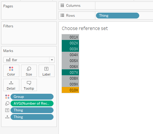
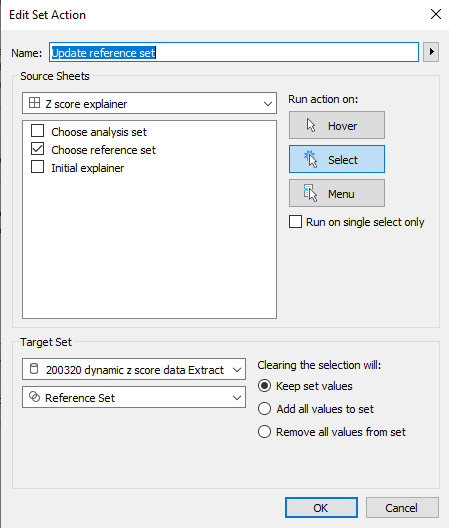
...and then the dashboard action like this:
Repeat for the analysis set, and you can build a dashboard a bit like this (click the image to see the interactive version on Tableau Public):
I'm using this to select an individual dimension, and then looking at how 010X compares to 001X through 009X. I'm plotting the actual value on the x-axis, because that's what I'll have to adjust in the factory if I decide to make any changes, and I've included the Z score in the tooltip.
The nice thing about using sets and set actions is that we can update these Z scores by changing the reference set. Maybe we'll find out that one of our things, say, 004X, was actually faulty and shouldn't be included in our set of 'normal' things that we're using as a reference. Do we need to re-run our entire data pipeline? Nope, just deselect it from our reference group selector.
Next steps: comparing Z scores
That's nice and everything, but let's take it a bit further. I know that 002X, 003X, and 007X were particularly good things, and ideally, all the things I manufacture in future will be like those three. So, I've created a new set called [High performance set], and I want to compare my WIP thing 010X to the high performance set based on the same reference set I selected earlier.
That means I've got a lot of comparisons going on:
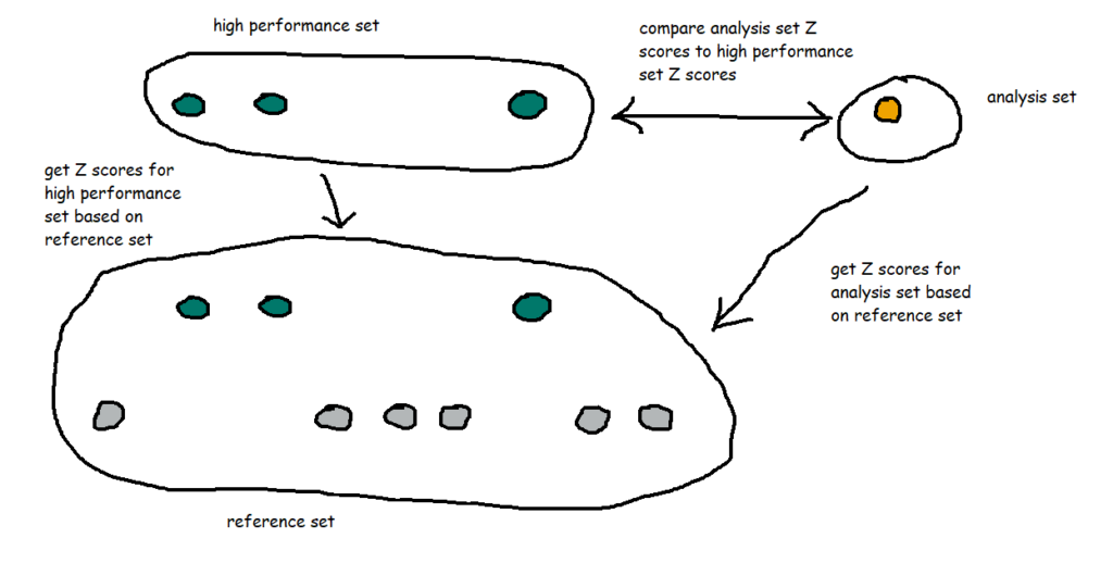
I also want to group my dimensions into themes. For example, A1 through A8 are technically separate dimensions, but they represent the same kind of thing taken at different points - maybe it's the thickness of a circular plate at eight different points around the circumference of the plate, or maybe it's the weight of eight different ball bearings in the same part of the thing, or something like that. So, since they're all related, I want to see how 010X compares to the high performance set across the A dimensions as a group of dimensions. In my workbook, I've simply grouped them by regex-ing out any numbers from the dimension name.
I've created a dashboard like this (click for interactive version):
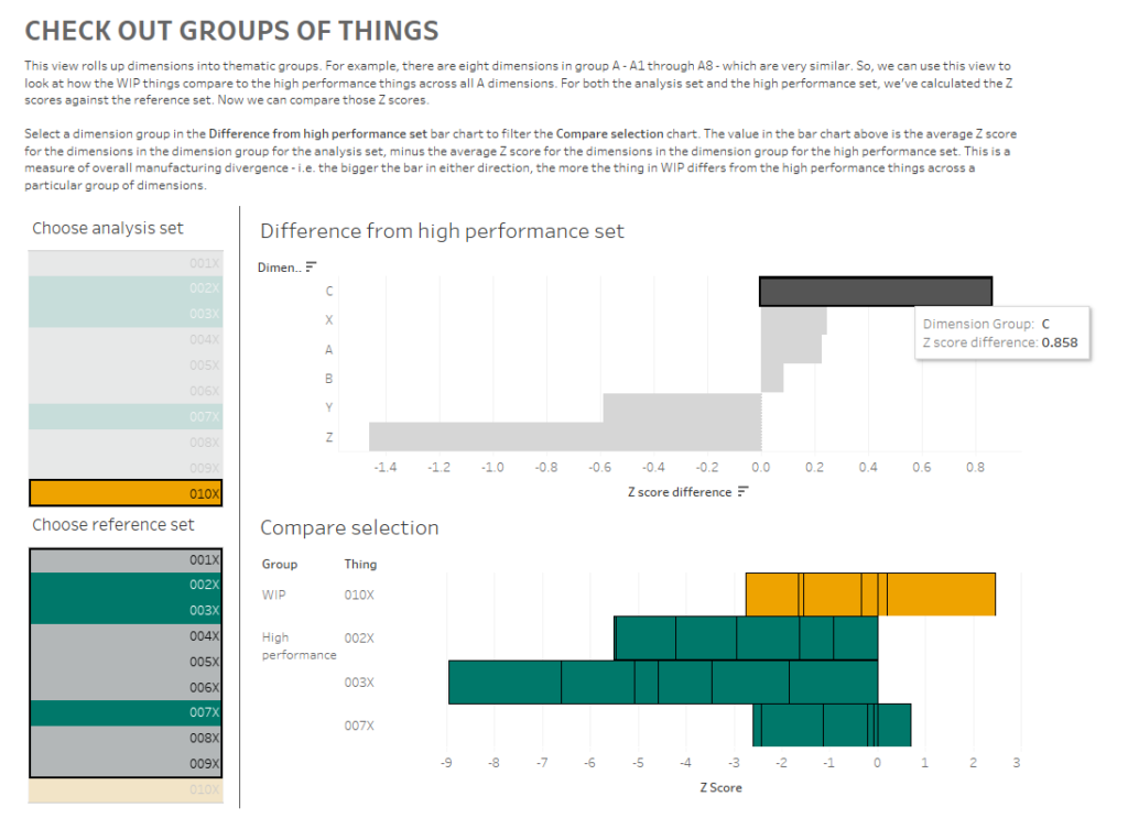
What am I doing here? In the bar chart at the top, I can see how the Z scores for 010X compares to the Z scores for the high performance set for each group of dimensions. I'm finding the Z score for each dimension within a dimension group, and comparing the average Z score for each dimension group for the analysis and high performance sets.
What I'm seeing here is that, on average, the C dimensions in 010X are higher than the high performance set. If I click the C bar, it'll filter the 'compare selection' chart:
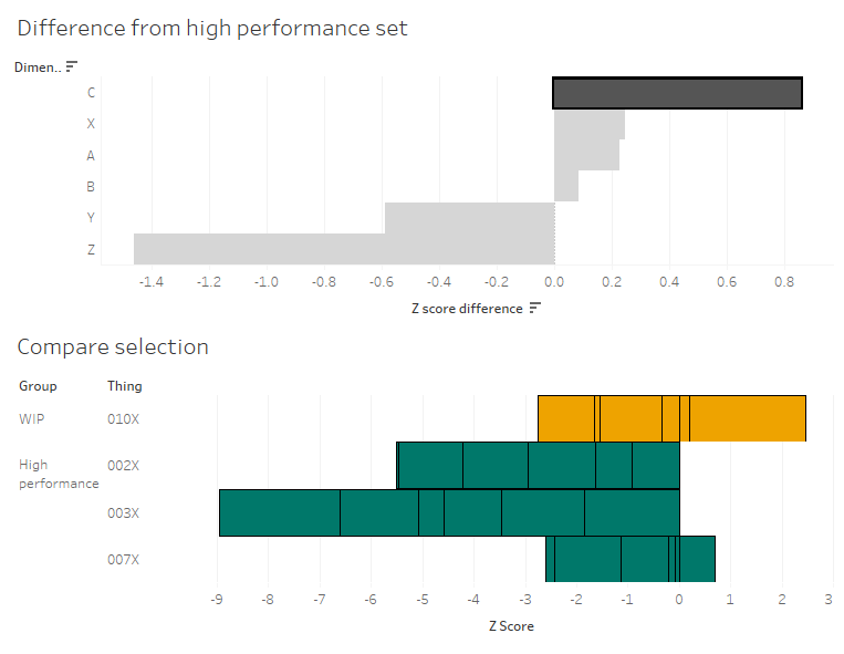
This stacked bar chart shows me the Z scores for all C dimensions for the things in the analysis and high performance sets. This is telling me that the high performance things tended to have C dimensions lower than normal across the reference group, and that while 010X also has some C dimensions on the lower side of normal, it's not as low as the high performance group. So, maybe my manufacturing specifications for the C dimensions are actually a bit high, and I should tune them lower if I want more high performance things.
Building the 'compare selection' chart is relatively straightforward - put the [Z score] field on columns, and stack your rows with the Group and Thing dimensions, as well as the IN/OUT value of the analysis set so that it's sorted nicely:

I've also created a calculation that returns a T/F value based on set membership and I'm using it to filter the view. It's simply:
[Analysis or High Perf set][Analysis Set] OR [High performance set]
...and I've set the filter to TRUE.
The tricky bit is getting the values for the diverging bar chart. I like using the compare selection sheet as a way of checking the calculations. What we want to work out is the average Z score across all things and dimensions for the analysis set, and the average Z score across all things and dimensions for the high performance set. Then we want to take the analysis set average and subtract the high performance set average to see the difference.
In other words, we want this:
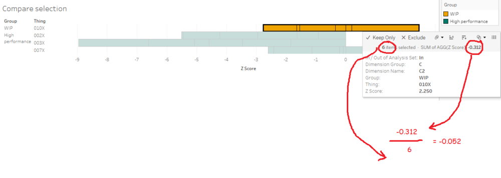
...minus this:
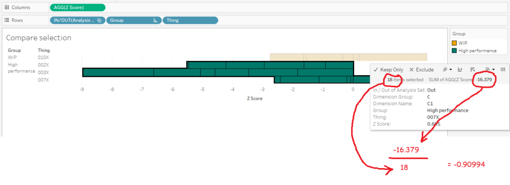
...which should give me 0.857944.
The first thing we need to do is to create a new field: [Thing-Dimension]. It's just a concatenated field of [Thing] and [Dimension Name], like this:
[Thing-Dimension][Thing] + '-' + [Dimension Name]
To be able to plot the average Z scores and difference in a simple bar chart for each dimension group, we can't have the thing or dimension in the view, which means we need an LOD which includes those fields:
[Z score (LOD include Thing-Dimension)](
{INCLUDE [Thing-Dimension]: AVG([Dimension Value])}
- {INCLUDE [Thing-Dimension]: AVG([Reference Set Avg])})
/
{INCLUDE [Thing-Dimension]:AVG([Reference Set Stdev])}
Now we can use that field to work out the difference between our sets:
[Z score difference]AVG(IF [Analysis Set] THEN [Z score (LOD include Thing-Dimension)] END)
- AVG (IF [High performance set] THEN [Z score (LOD include Thing-Dimension)] END
Finally, we can create our bar chart! And it's nice and simple:

Let's just check the calc works. Is it 0.857944, as I worked out manually earlier on? Yup, it's showing up as 0.858 in my tooltip. Lovely:
Now that I've compared Z scores across groups of dimensions to get an idea of the general way that my things compare to each other, I can dive back into the actual data to look at what those differences are and potentially fix my manufacturing variance.
Here's my final dashboard (again, click for the interactive version). I've plotted the Z scores for all dimensions for 010X, and I can click any of those Z scores to update the scatterplot and marginal histogram of actual values below. I know that the C dimensions are a bit different for 010X in comparison to the high performance set, so let's have a look at those:
I can look at that scatterplot and instantly see which of the C dimensions are driving that difference between 010X and the high performance set:
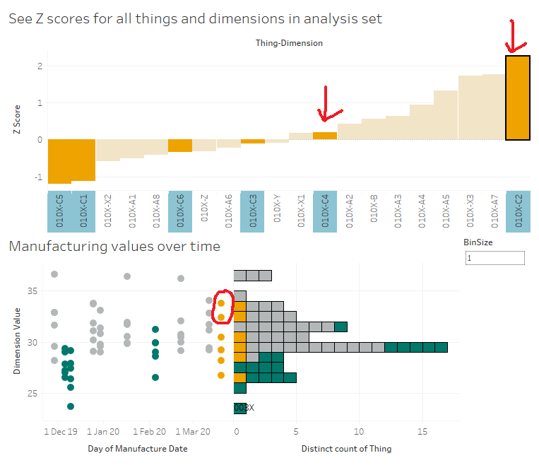
It's dimensions C2 and C4.
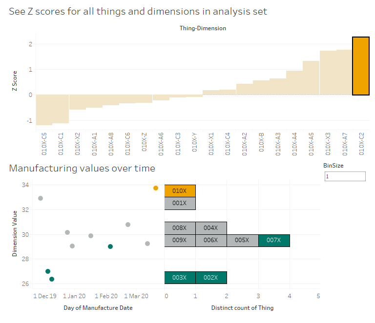
Let's start with C2. 010X has a high Z score of 2.25, and we can see in the scatterplot that this is a higher value than normal. As it is, that should be raising flags in the factory - that's a high C2 value, both absolutely and relatively, so we should probably turn it down a bit to be more in line with the others at around 30. As an aside, it's interesting to see that the high performance set all have low C2 values, so maybe we should turn it down lower than 30 to be closer to the high performance set:
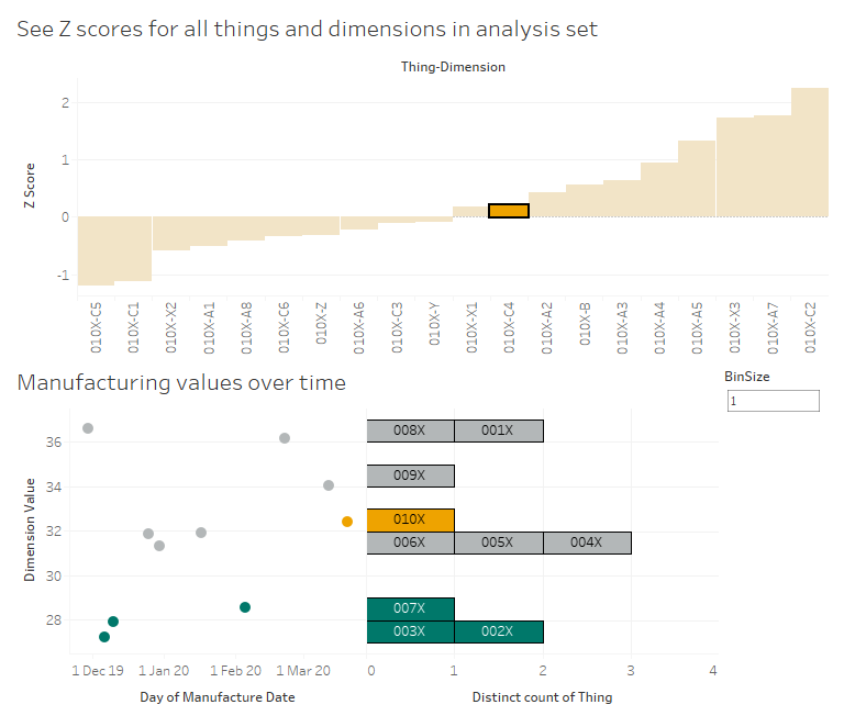
Now, let's have a look at C4. No issues there, right? 010X has a C4 value which is slightly higher than the average for the reference group, but the Z score is only 0.198, which indicates that it's pretty much bang on normal. However, we can see that even though it's normal for the reference group, it's quite a lot higher than the high performance group. So, again, maybe we're manufacturing C4 to a specification that says 'aim for a C4 value between 30 and 34', whereas we should consider amending those limits to between 26 and 30 based on how the lowest C4 values have all been the high performance things:
This is just a few of many different ways you can use Z scores and Tableau to look at manufacturing data. There are all kinds of interesting use cases out there - hopefully this explainer helps you build some of your own.
