

In this first post in a series of blogs looking at using Tableau and Alteryx for reporting on Data Quality, I will be showing off a very simple example of how a Tableau Dashboard can be used to flag up the number of nulls in a given data set.
In subsequent posts we will dive into this topic in much more detail, by posing the question; What do we mean when we refer to Data Quality? Then subsequently following this up with some potential tools and strategies that will help us report on some of the answers to that question.
Use case
The use case that I'll be working with in this post is a student record system, and to keep things simple to start off with, I am only interested in looking at the number of nulls that are appearing in my records, as this is a very straightforward and quantifiable error to track.
The data in my fictional student records system has been sourced from the HESA website, Mockaroo and Kaggle. It contains information about my students that is captured when they register at the start of the academic year, and in the arranged into the relevant fields. Each row/record in the data represents a single student.
As an academic institution, at some point during the year I will need to complete a statutory return, and provide a data set compiled from my student record system to the Higher Education Statistics Agency (HESA). It is critical that is information is as accurate as possible because based on this information I will receive funding and be assigned a spot in University league tables.
Before and during the undertaking of this process I need to have a means of checking the health of my records that presents the information in a clear and actionable format, and this is where Tableau comes in...

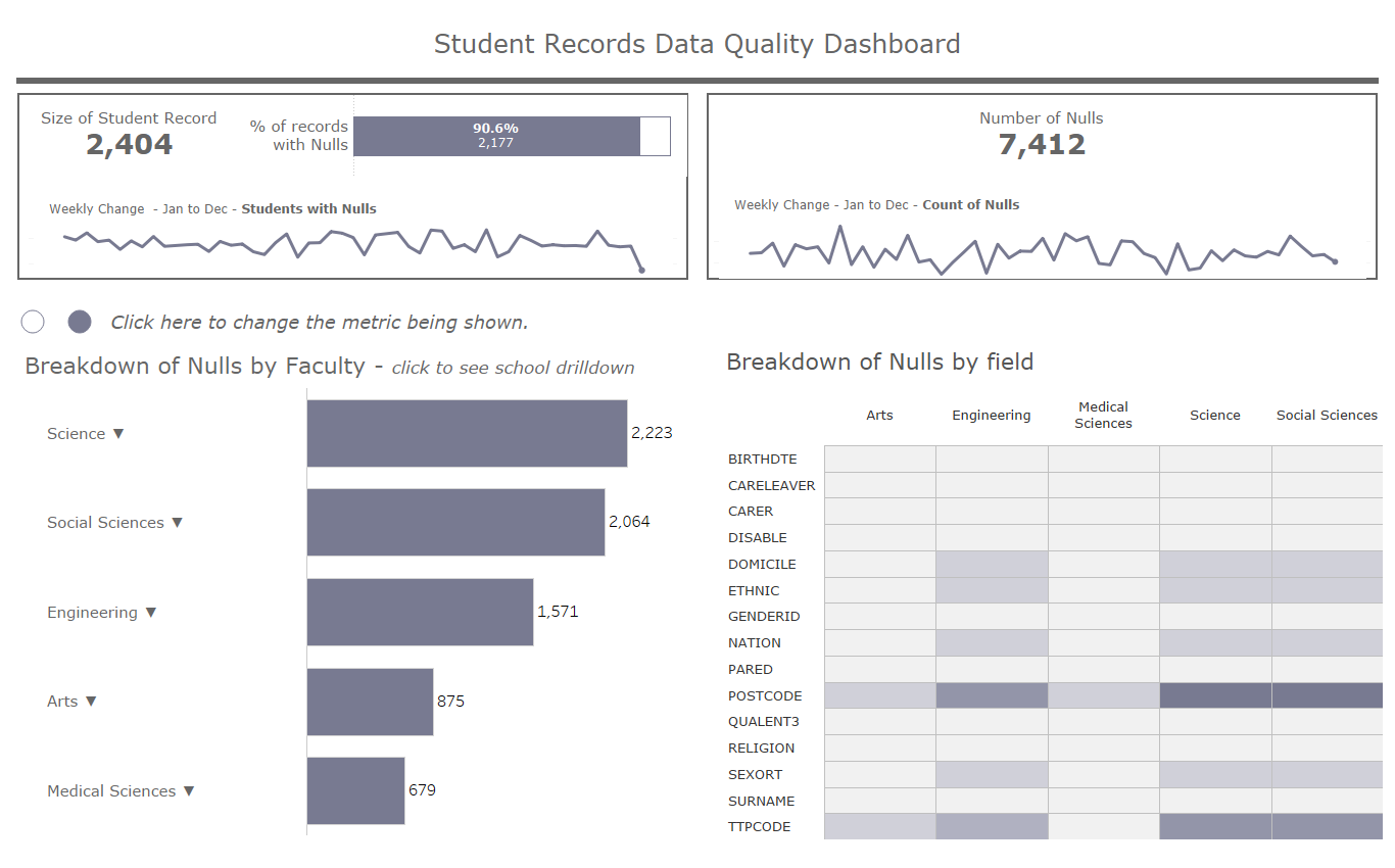
The image above shows the Tableau dashboard created to show the number of nulls in the record system. This information is being presented in two key ways throughout the dashboard; the total number of nulls, and the number of student who have null records.
How does the Data need to be structured.
As I mentioned earlier in the post, to build this view I used simulated data, and so the Alteryx workflow shown below is used to both to generate my data and shape into the format I need.
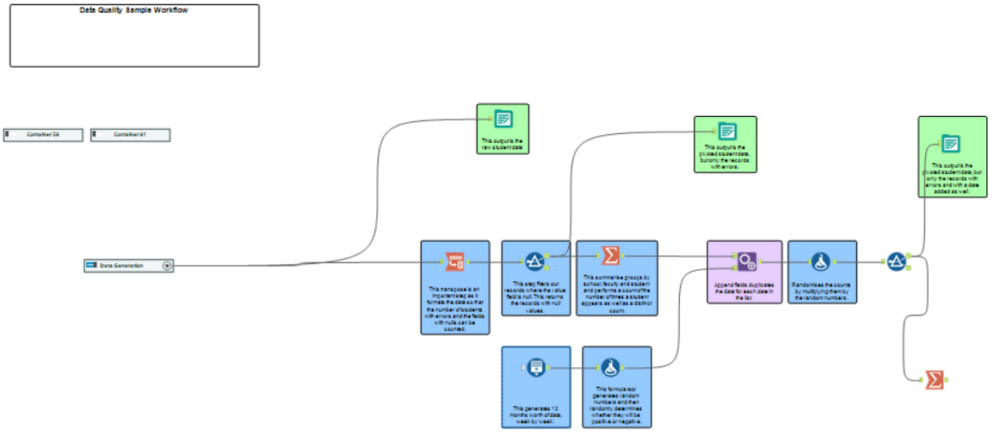
The benefit of what I've done here is that though I used alteyx to shape my data, these steps for the most part are tool agnostic and could be achieved with a tool or technology of choice. The main prerequisite with the data is the need to be able to reshape it so that the following are met:
- It is possible to isolate the rows with nulls from the full data.
- It is possible to pivot the rows with nulls and so that there is a column for the Student ID, School Faculty and the field which contained the null value. These can then be summed up in Tableau to provide a count of the number of students who have nulls in their record, or show that amount of times each field contained a null value.
- perform a group by to flatten the data and sum the number of nulls per student, while retaining the school and faculty they belong to.
- Capture a timestamp each time this process is run and append to a single file or table so there is a historic count of nulls.
These will be the three data sources that will be the input for the Tableau Dashboard.
- An output containing the full list of student records.
- Pivoted output of student records containing only the ones with nulls.
- Timestamped pivoted output.
Caveats of the Data format
The main caveats with this will be the maintenance of this data structure, where there was one source there is now three different tables, assuming that the entire student record was stored in a single table rather than multiple.
Secondly depending on the size of the student record, pivoting and then appending each output to a file with a timestamp could lead to some very large tables. So the storage concern is something to factor in.
Benefits of this view
Referring back to my use case, the main benefit of this view is being able to continually do a basic health check of the student records so that simpler errors can get fixed ahead of time. Making sure as many of these issues are resolved at admission and that relevant fields have been captured, with any missing fields can be followed up on.
Though this only shows the null records the benefit is that it can be used as tool to direct further investigation. For example if many of the null records are concentrated among a specific school or faculty, the perhaps it could be an issue around how that faculty captures it's data.
If a view such as this is published on Tableau Server then it would be possible to have the data sources published and refreshed regularly, with dashboard connecting directly to it, meaning anyone viewing the report would always have the most recent data. Some other server features such as data driven alerts would be a useful way to keep relevant parties up to date, by having an alert triggered once the number of nulls passes a given threshold.
Who is this for?
Analysts and administrators who maintain the student record system and need to keep a track errors that could ultimately hinder the progress of the statutory return.
Improvements
Below are some potential improvements that could be made to could made to this view in order to make increase it's usefulness.
- The inclusion of business rules that will aid in the classification of errors outside of nulls. For example checking that values in certain fields are correct.
- Showing the history of the heatmap - what are the historic null counts at the field level.
- The need to be able to generate a list of student IDs so that the erroneous records can be investigated further.