

 Now try again, what does each mark represent:
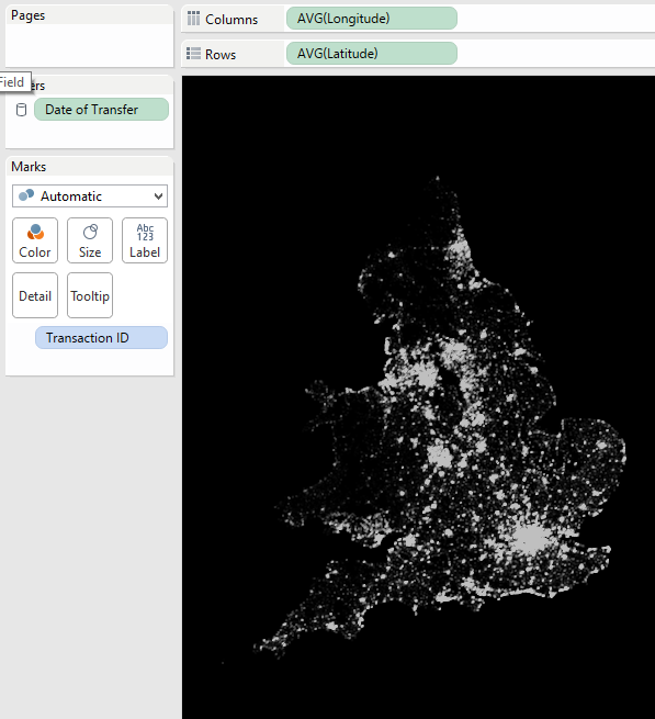
(incidentally this visualisation shows what the UK would look like if we asked only people who bought their house in 2014 to turn on their light - of course this suffers from the traditional mappers curse that it really only shows population density....)
 Easier second time round, right? What was the difference....well we could use the Detail Shelf to check what dimension was controlling our view in the second visualisations. In the first ones we were telling Tableau not to aggregate the measures and so we lost the visual indicators as to the Detail level.
Aggregate Measures
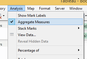
You'll find the option to Aggregate Measures in the Analysis Menu. If you haven't seen it before go find it....I'll wait....back already? Enjoy that? Good, now walk away from the menu item, back away...further. That's right, you wanna forget about this sucker. Push it right to the back of your mind.
Why shouldn't you touch Aggregate Measures....yet
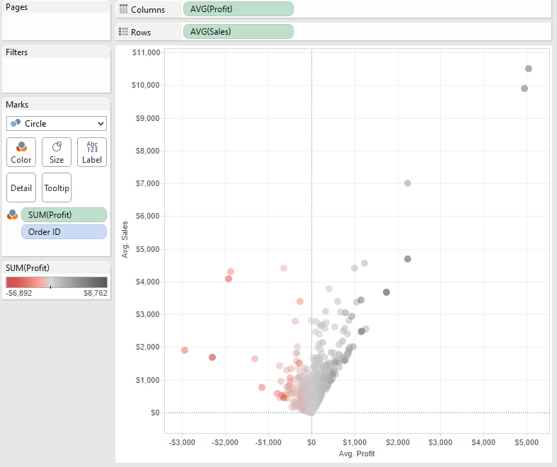
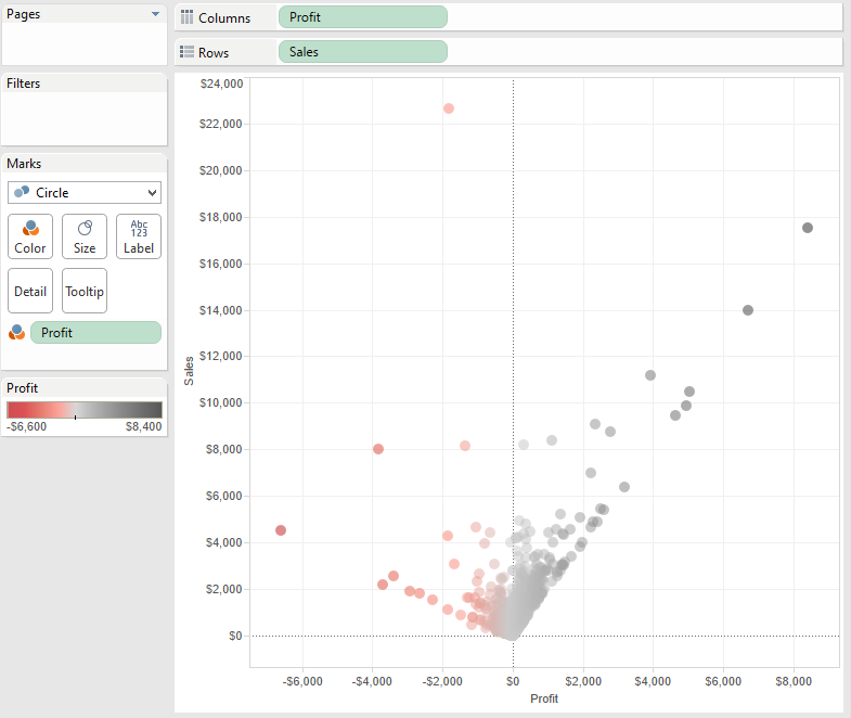
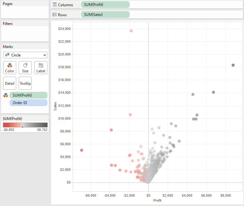
The Aggregate Measures option is the hot sauce of the Tableau world. Use it sparingly. By 'use it' I mean leave it as the default, On, never turn it Off. By default it's On and that is for a very good reason. Tableau loves to aggregate. Yes, it's what it lives for, it's the default behaviour and by golly it's the reason we love Tableau.Yes, aggregation can be confusing. Double click two measures and you get a scatterplot of a single mark; that blows new users' minds. However, now we're in control; we can drag and drop onto the Detail Shelf. Want to look at that scatterplot by Category? Go ahead drag it onto Detail and there, Tableau just does it. Let me just reiterate You are in Control with aggregated measures.When I see new users playing with the Aggregate Measures option, turning it off, more often than not it's because they lost control. They are fumbling with what Tableau is showing them and they're trying anything to get the view they want. If you turn off Aggregate Measures you are letting Tableau take control of what it shows, it is showing row level data, and so you'd better be sure that that is what you want.Let's look again at the second image above, the scatterplot, it's from the Tableau Superstore Sales sample data. What is the row level of Superstore Sales?You might be tempted to say Order level. But let's look at that other view where I'm in control....It's very subtly different!
Yes, there are multiple rows for some Orders in the data. So perhaps it's basket level....anyway regardless of what level the data is, don't you want to stay in control?! It's much easier to read (as the first exercise showed) and it's much easier to explain!So the key lesson here is that unless you really, really know what you want to do then leave Aggregate Measures alone.Don't be tempted by Dimensions!
Now then, we also need to talk about converting a measure to a Dimension to work around this 'detail issue' because it's tempting. I've done it. And down that route madness lies......Let me show you why....In the images below I've set my view to have sales as as a dimension (as you can see)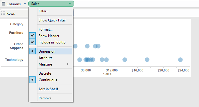
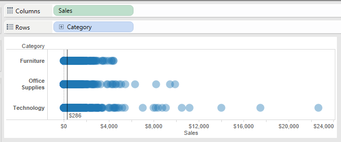 I've added an average line, my aim is to show the range of Sales we've made per Basket and I want to show the average over all Categories. Fine, job done, but wait...here's the same view using a sales as a Measure and with Aggregate Measures turned off..
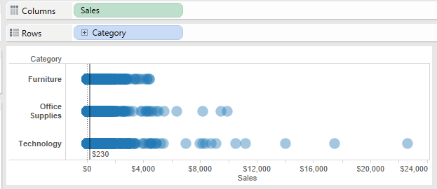 Notice the Average is different.....Whaaat?!The key to realising the difference is realising that as a Dimension Tableau will show only ONE mark for each value, however as an (un-aggregated) measure Tableau will show as many marks as there are for that Sales item. e.g. if two items have been sold at $5, Tableau will show two marks, one of top of the other.....in the first view it will show one. Meaning the Average is skewed in the former case.Here's a simpler example using only three sales Values: 1, 1 and 3
3 rows of Data
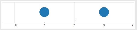
With Sales as a Dimension we have two Marks so the average is (1+3)/2 = 2
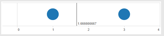
Now we have three Marks (two have Sales 1 so they're on top of each other) so the average is (2*1 + 3)/3 = 1.6666
So be very careful using a measure as a dimension in order to remove aggregation as it can lead to pitfalls.Why use Aggregate Measures then?
So after all this 'stay away' business, why is the option there? Well it's all about giving the advanced user control over their visualisation..in the right hands you can shortcut to the Viz you want using Aggregate Measures very quickly. But there's another good reason:Let's Talk Performance
Yes there's another very very good reason for turning off Aggregate Measures vs using the Detail shelf to control the level of detail and that is performance. When I was building the House Price map for this blog I build the same view twice, two different ways, and there were nearly 900,000 marks in each. Think about what happens in each situation:Aggregate Measures OFF = 'Hey Mr Database give me every row you have'
Aggregate Measures ON = 'Hey Mr Database can you group by Transation ID and give me the Average Latitiude and Longitude'
The result is the same, but in the latter case the database has to do a lot more work. In my test, albeit a sample of one, Aggregating Measures ON was over 10x slower.
Hot Stuff!
So remember there are elements of Tableau that are like Hot Sauce, use them sparingly and you'll enhance your experience; go overboard and you'll have smoke coming out your ears before you know it!