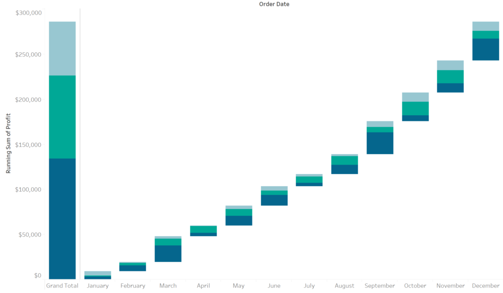
What is a waterfall chart?
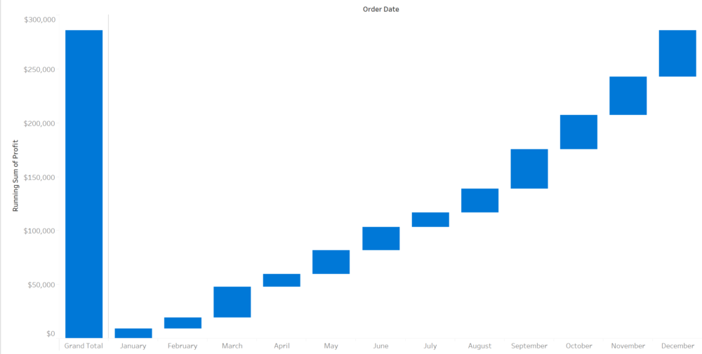
A waterfall chart is a popular visualisation within the corporate and financial sector; it's also known as a cascade chart or a bridge chart. It can be seen as a bridge chart when it's visualised with connecting lines between each 'floating bar', this is thought to make it look like a bridge as shown in the example below, which was based on Workout Wednesday Week 48.
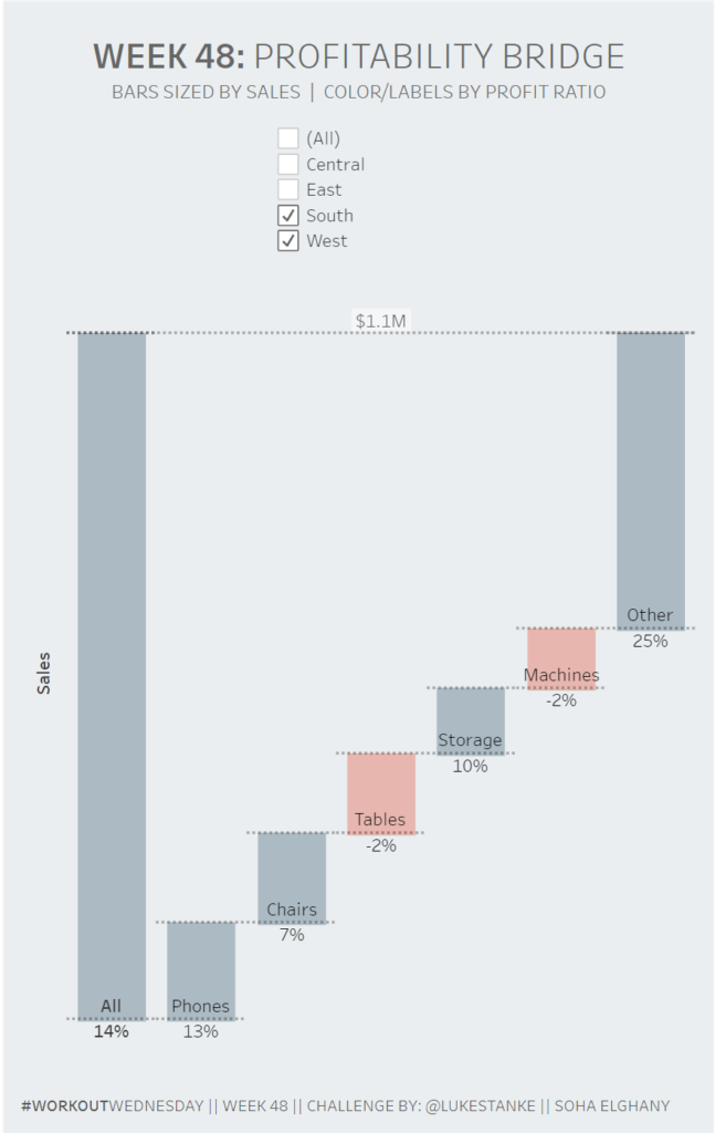
A waterfall chart is used to show how positive or negative values contribute towards the total, it is also utilised to show parts of a whole. This is seen to be an ideal way to visualise how a dimension can have a positive or negative impact on the resulting end value.
This chart type is utilised to help with understanding the gradual increment or decrements in the quantitative value, for example showing changes in profit by different categories.
Questions to ask yourself?
There's no denying this chart is popular in the corporate sector. However, it's your job as a data visualisation analyst to assess if this chart type is the best way to visualise the data, or is this simply what your users want because this is what they are used to seeing.
You can use a waterfall chart to show parts of a whole but there are also other charts to consider such as:
- Pie charts
- Tree maps
- Stacked charts
Andy Kriebel created an amazing visualisation that acts as a guide on what charts to use -> go here to see it.
How to create a waterfall chart?
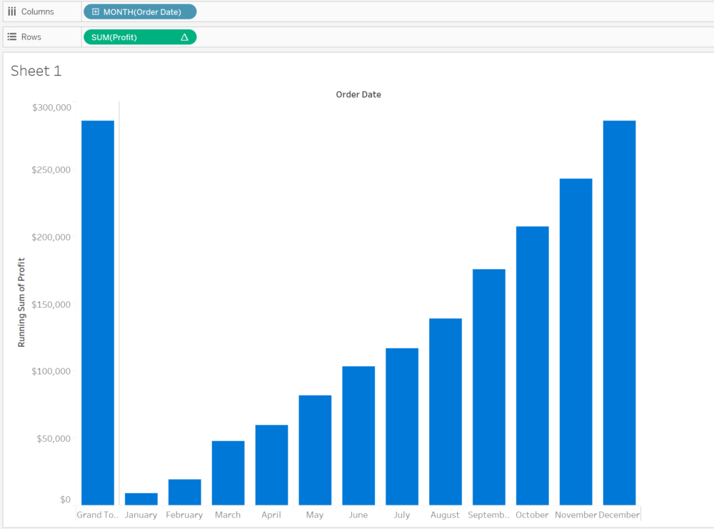
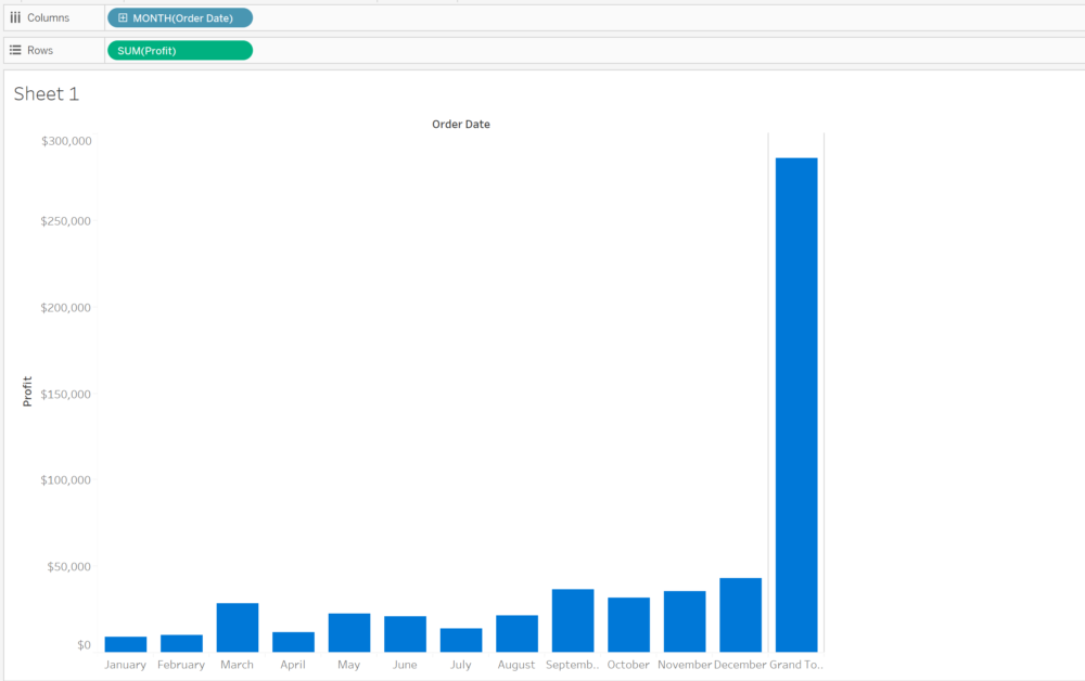
To start off with let's connect to superstore data set in Tableau and create a bar chart looking at profit over time, with the grand total added included there like this:
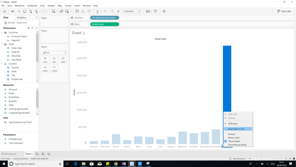
I want to move the total bar to the left, this is something simple to do: Right click on grand total and select the option to 'Row total to the left' as shown in the image below:
Now we need to add a table calculation to get the running total over time.
What is Running Total?
A running total is a total that consistently changes every time a new sequence of numbers is being added to the data set.
There are several reasons as to why you would want to do a running total:
- It allows you to view the total at any point without having to always sum the entire sequence.
- It offers a record of the sequence itself
- This shows the summation of your data as it grows
A running total is a table calculation built in tableau, this aggregates values cumulatively. Tableau gives you the option to calculate the running total by:
- Sum
- Average
- Minimum
- Maximum
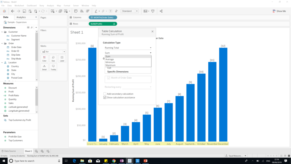
For this example we want to create a running sum total for each order data; make you have selected order date under select a dimension.
The image below is what you should expect to see:
Next we need to change the mark type to Gnatt Bar, then to create the waterfall chart we need to create a calculation to size the Gnatt bar. This will extent the Gnatt bars and bar them look like floating bars and have them line up correctly, since for this example we don't want the gnatt bar to be higher than the totals.
To do this we take our measure value, which in this example its profit and we put a minus sign in front of this like this:
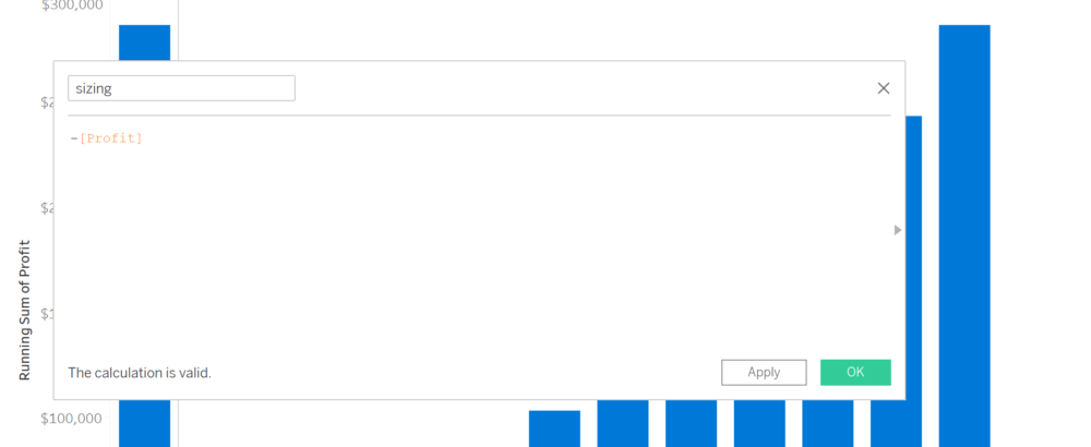
Now put this calculation on size in the marks card to create your waterfall chart:
How to add a second dimension to your waterfall chart?
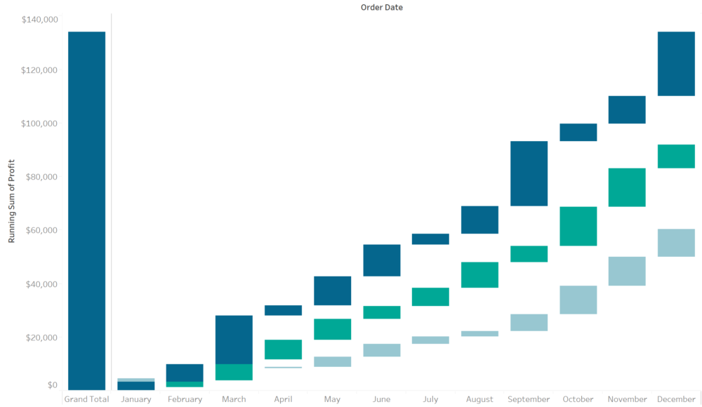
Now you have your waterfall chart, what if you want to include a second dimension such as customer segment. First put customer on colour and what you'll see is that your waterfall chart breaks because you're not calculate your running total by each customer segment and date:
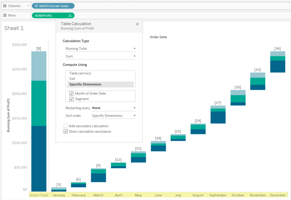
What you will have to do is edit your table calculation and remember to select the customer segment option under specific dimension.
Tada, you are done!
If anyone has any question concerning waterfalling your way through Tableau ask away and I'll answer.
